In this article, we’ll get rolling on developing plug-in free by creating bar graphs and similar graphics, using NASDAQ’s current web site as an example. But we won’t be creating merely a picture of a bar graph, but a real, interactive bar graph. Let’s take a look at an existing site that uses Flash, then build one using HTML5.
If you have Flash installed, you’ll see a fancy line chart. You can float your mouse over the line and see a small popup showing the stock price at that point, along with the volume of trading, like so:

If you don’t have Flash installed, then the site just shows you a graphic image. So you’re not left out completely without Flash, but with HTML5, we can include everybody.
Now, we’ll build something similar. To keep this article from getting too long, let’s just show the data in a box below the graph. But as you move the mouse along the graph, or touch it on a tablet, it will highlight the closest point on the graph, and show the information for that point in a box. Here’s what the final product will look like: Read the rest of this entry »
Include Pace.js and the theme css of your choice, and you get a beautiful progress indicator for your page load and ajax navigation. No need to hook into any of your code, progress is detected automatically. You can choose the color, and the effects like Minimal, Flash, Barbar Shop, Mac OSX, Fill Left, Flat Top, Big Counter, Corner Indicator and Bounce.

Requirements: –
Demo: http://github.hubspot.com/pace/docs/welcome/
License: License Free
Codrops has showed us how to reconstruct the Google Nexus Website Menu. It slides out with a really nice effect where some subitems get expanded as well. When hovering over a special menu icon, the sidebar icons will be revealed. When clicking on the icon, the whole sidebar menu will be shown. The first sidebar menu item is a search input which is styled the same way like the other menu items.
We will reconstruct this menu using unordered, nested lists and some CSS transitions. We’ll use JavaScript to apply classes for the opening effects and handling the hover and click events. With the help of a media query, we’ll adjust the size to make sense for smaller devices as well.

Requirements: –
Demo: http://tympanus.net/Tutorials/GoogleNexusWebsiteMenu/
License: MIT License
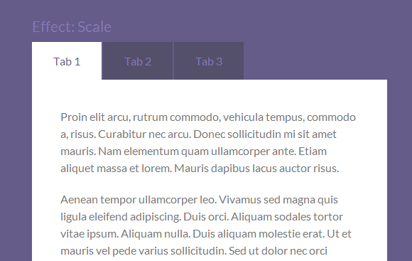
Tabulous.js is a jQuery tabs module for todays web. Tabulous.js can be used with any contents you choose in the tabs and it couldn’t be more simpler to use.
Simply include jQuery and the tabulous.css and tabulous.js files before <head> section. Once you have created your tabs you can initiate the plugin with $(‘#tabs’).tabulous(). You can customize the effects with options like scale, slideLeft, scaleUp and flip.
Requirements: –
Demo: http://git.aaronlumsden.com/tabulous.js/
License: MIT License
As browser adoption of HTML5 continues apace, developers are finding more and more options for creating elegant, highly responsive UIs. In the case of Scalable Vector Graphics (SVG), what’s old is new again, and quite slick.
The SVG spec has been around for a while now. Under development since 1999, the spec, or more accurately a family of specs, describes an XML-based file format for vector graphics. An SVG block defines the individual components of a vector image, such as paths, shapes, fills, strokes and other features. This provides a lightweight option for certain types of graphics that might otherwise have been created in Adobe Illustrator or Inkscape and then exported to a raster format. It also promises a raft of potential functionality in manipulating an image on the fly—hence the “scalable†part of SVG.
With widespread adoption of HTML5 standards, browsers are taking SVG in new directions, such as emphasizing the <svg> tag for inline SVG, using CSS for styling, and opening up the DOM so that SVG images can be created or manipulated on the client side with JavaScript.
To demonstrate, this series of walkthroughs will aim to benefit humankind in two ways. One, it will cover SVG examples that are compatible across browsers, while pointing out some of the differences in SVG adoption. Two, it will more or less accurately predict one’s chances of surviving a zombie apocalypse. Read the rest of this entry »
When I started out on this app I was only really just interested in seeing if the web platform had really evolved to a point where an app like the hugely popular Instagram app could be built using just HTML, JavaScript and CSS. As it turns out we can in fact do exactly that. This article walks you through the technologies that make this possible and shows how it is entirely feasible today to build interoperable web applications that provide a great user experience no matter what brand of browser the user is running.
If you happen to be one of the two or so people who have not heard about Instagram then you might be pleased to hear that it is a hugely popular photo sharing and social networking service that allows you to take pictures, apply interesting digital filters on them and share them with the world to see. The service got so popular that it was acquired by Facebook for a bag full of cash and stock in April of 2012.
InstaFuzz is the name of the app I put together and while I don’t expect to be acquired by Facebook or anybody else for a billion green it does however make the case that an app such as this one can be built using only standards compliant web technologies such as Canvas, File API, Drag/Drop, Web Workers, ES5 and CSS3 andstill manage to runwell on modern browsers such as Internet Explorer 10,Google Chrome and Firefox. And you could easily use the code to build a Windows Store app too.
About the app
If you’d like to take a look at the app, then here’s where it is hosted at:
http://blogorama.nerdworks.in/arbit/InstaFuzz/
As soon as you load it up, you’re presented with a screen that looks like this:
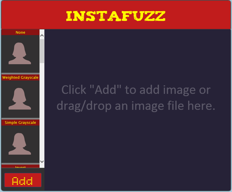
The idea is that you can load up a photograph into the app either by clicking on the big red “Add†button on the bottom left hand corner or drag and drop an image file into the blackish/blue area on the right. Once you do that you get something that looks like this: Read the rest of this entry »
Today I’d like to talk about picture manipulation in HTML5, using pure Javascript.
The Test Case
The test application is simple. On the left a picture to manipulate and on the right the updated result (a sepia tone effect is applied):

The page itself is simple and is described as follow:
<!DOCTYPE html>
<html>
<head>
    <meta charset="utf-8" />
    <title>PictureWorker</title>

    <link href="default.css" rel="stylesheet" />
</head>
<body id="root">
    <div id="sourceDiv">
        <img id="source" src="mop.jpg" />
    </div>
    <div id="targetDiv">
        <canvas id="target"></canvas>
    </div>
    <div id="log"></div>
</body>
</html>
The overall process to apply a sepia tone effect requires you to compute a new RGB value for every pixel of the existing source picture, and then render it on the <canvas> tag with id=”target”. Below are the formulae we use to create the new RGB values from the existing RGB values of a pixel:
finalRed= (red * 0.393) + (green * 0.769) + (blue * 0.189);
finalGreen = (red * 0.349) + (green * 0.686) + (blue * 0.168);
finalBlue= (red * 0.272) + (green * 0.534) + (blue * 0.131);
To make it a bit more realistic, I’ve added a bit of randomness to my sepia formulae. I create a noise value which ranges from 0.5 to 1, which determines the degree to which my final pixel output matches the RGB value calculated via the formulae above, versus the degree to which it retains it’s original RGB values.
Read the rest of this entry »
This article recently appeared on BuildNewGames.com, a collaboration by the teams at Bocoup and Internet Explorer.
With the large number of varying screen resolutions available on today’s HTML5 gaming
devices, it is now advisable to give some consideration to incorporating vector graphics into your games.
SVG, or Scalable Vector Graphics, is an open standard, XML-based format developed by the W3C for representing vector graphics. Using SVG files for HTML5 game development is the main focus of this article.
Vector Graphics
Adobe Flash developers have long enjoyed the ease with which they can create attractive and, somewhat more importantly for browser-based games, scalable vector graphics.
Advantages of employing vector graphics for HTML5 game development include:
- Scalability without loss of clarity
- Manipulation of individual components
- Client-side, rather than server-side, processing
- Potential for animation and, almost certainly, interaction.
Let us address each in turn, using the following SVG file created using an
open source vector graphics editor.

Scalability
The capability to scale vector graphics without losing image quality is the primary benefit of using SVG files. Given the varying screen resolutions of the devices on which people are today playing HTML5 games, SVG files provide the most pleasing result when scaled.
Let’s use our beast SVG file to demonstrate.


The image on the left is the result of scaling the vector graphics version of our beast. Lines remain clean and clarity is retained.
In the the image on the right, the result of scaling the bitmapped version of the same region of our beast produces a rendered result with considerably less definition. Edges of primitives are noticeably pixelated.
Read the rest of this entry »
This article recently appeared on BuildNewGames.com, a collaboration by the teams at Bocoup and Internet Explorer.
“Responsive design†is a fairly popular buzzword in modern web development. The idea behind responsive design is that an interface is designed and should be built such that it can be adapted to any technology, any screen format; some form of the interface should work just as well for an Android phone as it does for a 27†Apple cinema display. It’s a design that flexes and shuffles around content to match the assumed expectation of the user based on context; that context is defined by the technology, use case, and location. So, then, what happens as we build extremely interactive applications- that is, games- on the web? Often, we find ourselves conflicted; “do we support IE 7? Or 8? What about Opera? What about mobile? How about Japanese, or Hebrew?†Traditional approaches involve generating a minimum-requirements spec, where we limit the potential number of users in return for cheaper development and support costs.
There is, however, an interesting and compelling way around this conundrum to engage a much larger market. We can shift around the problem entirely by providing an entirely new class of entertainment to our end user. What I propose is a progressively enhanced, responsively designed approach to web gaming that encompasses all devices, everywhere, by providing engagement across all levels.

This involves breaking away from the idea of building a game, and instead, building a lasting, engaging experience.
This isn’t a new idea; it’s simply subtle. Mass Effect, by BioWare, has launched campaigns that involve mini-games for the iPad 1. Many online games have official forums. EVE Online, by CCP Games, supports building offline social connections; many players in the same corporation talk together in voice chat, IM, forums, and meetups, allowing the chance for tremendously deep interaction without even loading the game client 2. Rich meta-game experiences keep players involved even while not actually playing the game, and often are the result of just a little bit of extra effort. All of these things are supported by the common infrastructure provided by the Internet. Read the rest of this entry »
This article recently appeared on BuildNewGames.com, a collaboration by the teams at Bocoup and Internet Explorer.
Until recently, performance of browser-based games for mobile devices has lagged significantly behind desktop performance. If you wanted to create a Canvas-based mobile game, performance was terrible and you needed to build your game around the limitations of the platform. Developing a usable game meant using tricks like scaling up from very low resolutions or doing partial screen updates instead of full refreshes, meaning your game design was limited by the platform’s weaknesses rather than your creativity.
Luckily, this has changed. Browser vendors are rapidly improving their mobile performance:
- iOS5 now ships with Nitro Javascript
- Chrome for Android browser is now available on Android 4 (Ice Cream Sandwich)
- Windows Phone 7 Mango launched IE9 mobile with hardware acceleration
All feature a GPU hardware-accelerated HTML5 Canvas element and both feature multi-touch support inside of the browser, a must for any but the simplest games. While Chrome for Android still have some significant work to do on Canvas performance, this now seems like an inevitability rather than a hopeful prayer.
Developing HTML5 games that work in the mobile browser comes with its own special set of requirements. You’ll first need to have an idea of the number of sprites you can push on the screen at once. Next you’ll want to maximize your game to the size of screen so that users don’t have to squint to play your game. Next you’ll need to add touch controls so the game will be playable without a keyboard. Finally you’ll want to consider adding a number of pieces of meta-data to allow your page to be used a home-screen application and have it show up with the right icon.
Performance Considerations
While mobile HTML5 game performance has increased significantly, you do still need to be aware of the limitations of the two dominant platforms: iOS and Android.
You have two primary options when building an HTML5 game: either build it with Canvas or use CSS sprites. For example, before iOS 5, you’d achieve much better performance in general using CSS sprites, provided you weren’t moving too many of them each frame. This was (and generally still is) the case with Android. Browsers have been optimizing the rendering of HTML elements for a long, so unless you are moving a full page’s worth of tiles and sprites, CSS sprites are still something to consider.
Now with hardware acceleration, Canvas performance has reached a level where where full screen action games at CSS pixel resolution are possible. Read the rest of this entry »


