The more than 59,000 free plugins in the WordPress official
directory deal with nearly every feature or function to be put to use in any
type of website. Premium WordPress plugins from third-party marketplaces are
also available. The largest, CodeCanyon, has over 5200 WordPress plugins.
The question is, do you have the time to sift through
59,425 free plugins? Would you do so even if you did had the time?
We tested scores of WordPress plugins, narrowed the options,
and listed what we consider to be the 8 top WordPress plugins for a range of key
functions and purposes.
We looked at plugins for –
- building stunning website landing pages with
ease.
- visual storytelling featuring unique and
engaging user experiences.
- managing and displaying financial, statistical,
scientific, commercial, and other types of data.
- automating the booking of appointments and
events.
Since the majority of the following plugins offer a free
version, you’ll be able to build your website for a minimal cost.
The following review provides important knowledge about these
8 great WordPress plugins for 2024:
Read the rest of this entry »
Httpster is a showcase of damn fine website design, lovingly curated and categorised so we can perv on it at our whim. They love good typography, and effective, unpretentious design; in short, simple ideas executed perfectly. While they aim to showcase excellent development as well, they apologise in advance for including poorly coded stuff if it just looks so damn good.

Requirements: –
Demo: https://httpster.net/
License: License Free
UI Movement started out as a newsletter that featured the best UI designs every day. The main real difference between UI Movement and other design inspiration sites, is that they focus exclusively on UI designs. Since the original, simple newsletter format, UI Movement has been updated to make for easier browsing and filtering. Each new design is tagged so that you can easily find the most popular design animations for whatever design element you’re interested in. For example, here you can see the most popular map design animations. UI Movement is build with Django on the back end and uses the Foundation framework on the front end.

Requirements: –
Demo: https://uimovement.com/
License: License Free
Collect UI is a platform for your daily inspiration collected from daily ui & beyond. Based on Dribbble shots, hand picked. “When browsing Panda’s Dribbble popular feed I often see shots from daily ui challenge getting popular. They look pretty cool and designers are drawn to this activity because of the absence a of client or supervisor pressure. Some people think that daily ui challenge is filling up dribbble with never-ever-used designs, but I see them inspiring in context of layout choices, color palette preference, fonts in use and ui elements in the specific design challenge. Unfortunately these posts fade away once they’re not listed anymore in Dribbble’s popular section. But the challenges chosen are so good that you they serve as a great source of inspiration.” Panda Network said.
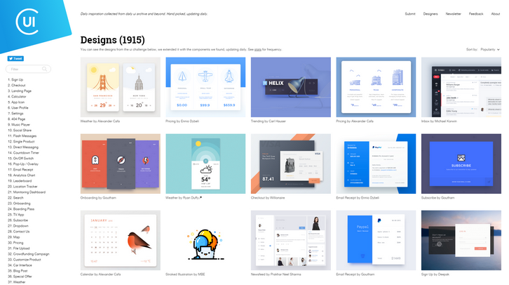
Requirements: –
Demo: http://collectui.com/
License: License Free
Muzli 2 is connecting passionate people with the inspiration that drives them. By default, Muzli will load only the bare minimum of content and wait for you to show interest before fetching the entire feed. In addition, you now have access to the normal stuff available in the default Google new tab; like quick links to your most visited website and a regular ol’ Google search.
For those of you who prefer seeing everything, every time, like you’re used to- the option to disable the minimal view is accessible through the options in the user menu on the to right corner.
Simply hover over the sidebar to reach the “Edit†menu and enable, disable or reorder your favorite sources. You can fine tune your source list at any time and the changes you make are reflected immediately. Every post includes a number which indicates how viral/popular it is. They aggregate the number of social media signals from almost all of the relevant sources including Facebook, Google, Pocket and many more. Try the Muzli 2, we think it’s awesome & it’s completely free!

MaterialUp is a daily showcase of the very best Material designs apps, websites and concepts. Each design is carefully selected to showcase great work by promising and/or talented designers. The core value of MaterialUp is to give as much value to designers as possible. Why? Because they’re the ones who should be credited for all the work that will be featured on the site.
Anyone is more than welcome to submit a Material Design work that they love, which will then be reviewed and eventually published (if accepted). If it’s not your design, they encourage you to provide the name(s) of the designer(s), so that their work is always credited.
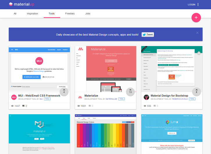
Requirements: –
Demo: http://www.materialup.com/
License: License Free
Hover States is a collection of what’s new & interesting in user interface and interaction design. The goal of Hover States is to serve as a source of inspiration for designers and developers and to showcase the amazing things people are doing on the web. They believe the beauty of interaction design is the way it moves and behaves, which is why they showcase all content they discover as video.

Source: http://hoverstat.es/
Once upon a time, three guys worked together. They shared inspiring links, drank bad beer and celebrated birthdays with cake and good cheer. Then, one of the three guys had an idea. A brilliant idea. What if there was a way to share these links with others?
And so, Muzli was born. Muzli is a labor of love, a product designed, coded and maintained because they enjoy it. Because they love it. Because they live it. Muzli is the content that drives them. And they hope it inspires you. All the design inspiration you need. It’s like crack for designers. And good for you too.
Requirements: Chrome Browser
Demo: http://muz.li/
License: License Free
Codrops has shared some inspiration for adding elasticity to SVG elements. The idea is to integrate an SVG element into a component and then animate it from one path to another with an elastic animation. Using SVGs like this can make things like menus, buttons or other elements more interesting and make the interaction look more organic with a natural feel to it.
It’s of course important to keep things subtle and not exaggerate the bounciness. The nice thing is that we can give a more “realistic†interaction feedback to the user. Especially touch feedback can benefit from using this kind of effect. Based on this idea, they’ve created some inspirational examples of contexts where a morphing shape animation enhancement could make sense.
Requirements: –
Demo: http://tympanus.net/Development/ElasticSVGElements/
License: License Free
Muzli is the ultimate designer’s toolbox. Bringing you the freshest design, UI, UX and interactive news and shots from around the web. All the design inspiration you need. You can enjoy the most inspiring stuff out there. Never miss the next big thing. Muzli will replace your default tab, it will become your home page, so you don’t miss anything.

Requirements: Chrome Browser
Demo: http://muz.li/
License: License Free