Fonts can make or break a project. Finding the right elegant font can be particularly tricky, though, since the intricate detail can often render your words illegible. That’s why Laura Worthington’s Samantha Script font is so perfect. Elegant and easy to read, this beautiful font is also significantly marked down for a limited time, due to this Mighty Deal.
You’ll get 1,100 alternate and swash letters that feature ascenders and descenders, all varying in length and complexity, so you can truly fine tune the look of your font. In addition to all the stylish letters, this collection includes 60 beautiful ornaments to complement your text, adding an even more artistic flair to your work.

The full Samantha Script font family, which includes all 4 styles, normally sells for $300, but for a limited time only, you can get the entire family for just $37! That’s a whopping 87% off the regular price!
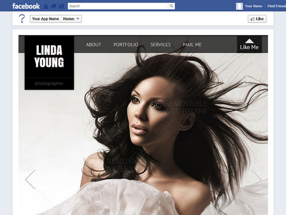
Facebook fan page is essential and useful means in Social Network. Fan FBML Templates collected some attractive, versatile and functional iFrame flash and HTML Facebook templates with a set of tools and documentations is created for advancement of your business and personal usage.
Just update the necessary information and images, and you’re ready to go. And with this Mighty Deal from Fan FBML Templates, you’ll save a ton while enticing and impressing potential new users. This fantastic collection of Facebook Page Templates normally sells for $213, but for a limited time only, you can get all 10 for just $17! That’s a crazy savings of 92% off the regular price.
These days, it seems everything old is new again. Companies are intentionally making products look old and vintage as a style. The same rules apply to the Thirsty Rough Font Family from Yellow Design Studio. This professional weathered version of Thirsty Script combines both the modern and vintage worlds into one friendly cutting edge font.
If you’re looking to catch your customers’ eyes, you’d be hard pressed to find something more eye-catching than Thirsty Script Rough. It’s friendly, edgy, new, and vintage all wrapped up into one beautiful font. The Thirsty Script Rough Font Family includes a complete character set with letters, numbers, punctuation, symbols and an extended set of accented characters. The set also features ligatures, oldstyle numerals and multiple language support.

The Thirsty Script Rough Font Family normally sells for $49 (Desktop or Web Font versions), but for a limited time only, you can get either the Desktop or Web font version of this entire vintage set for only $9.
As browser adoption of HTML5 continues apace, developers are finding more and more options for creating elegant, highly responsive UIs. In the case of Scalable Vector Graphics (SVG), what’s old is new again, and quite slick.
The SVG spec has been around for a while now. Under development since 1999, the spec, or more accurately a family of specs, describes an XML-based file format for vector graphics. An SVG block defines the individual components of a vector image, such as paths, shapes, fills, strokes and other features. This provides a lightweight option for certain types of graphics that might otherwise have been created in Adobe Illustrator or Inkscape and then exported to a raster format. It also promises a raft of potential functionality in manipulating an image on the fly—hence the “scalable†part of SVG.
With widespread adoption of HTML5 standards, browsers are taking SVG in new directions, such as emphasizing the <svg> tag for inline SVG, using CSS for styling, and opening up the DOM so that SVG images can be created or manipulated on the client side with JavaScript.
To demonstrate, this series of walkthroughs will aim to benefit humankind in two ways. One, it will cover SVG examples that are compatible across browsers, while pointing out some of the differences in SVG adoption. Two, it will more or less accurately predict one’s chances of surviving a zombie apocalypse. Read the rest of this entry »
Screensiz.es helps you quickly find the screen specifications of the most popular devices and monitors currently on the market. The size data comes from Wikipedia, and for a better understanding of Pixel Density. The “popularity†guesstimates are derived from annualized monthly Google queries (from AdWords traffic estimator), and some fuzzy math.

Requirements: –
Demo: http://screensiz.es/
License: License Free
Autocompletion is a pattern that all Web users are familiar with. When you do a search, your search engine suggests terms. When you type a new e-mail message, your mail client suggest recipients. This functionality, however, has not been available to Web developers without a nontrivial amount of JavaScript. One of the new HTML5 elements, the , brings this autocomplete functionality to the Web natively.
In this article, I’ll describe what datalists are, when it’s appropriate to use them, their limitations and what to do for browsers that don’t support them. Let’s get started.
Creating Datalists
To show how a datalist works, let’s start with a traditional text input:
<label for="favorite_team">Favorite Team:</label>
<input type="text" name="team" id="favorite_team">
This field asks a user to provide his or her favorite sports team. By default, the user will be given no additional help to complete the field. But by using a datalist, you can provide a list of options the user can select from to complete the field. To do this, define a datalist with an option element for each suggestion:
<datalist>
  <option>Detroit Lions</option>
  <option>Detroit Pistons</option>
  <option>Detroit Red Wings</option>
  <option>Detroit Tigers</option>
  <!-- etc... -->
</datalist>
To tie a datalist to an input element, give the input element a list attribute and the datalist an id attribute that match. Here’s an example:
<label for="favorite_team">Favorite Team:</label>
<input type="text" name="team" id="favorite_team" list="team_list">
<datalist id="team_list">
  <option>Detroit Lions</option>
  <option>Detroit Pistons</option>
  <option>Detroit Red Wings</option>
  <option>Detroit Tigers</option>
  <!-- etc... -->
</datalist>
Notice that the list attribute of the input and the id attribute of the datalist contain the same value, “team_listâ€. This provides the link between the two.
That’s it. No JavaScript is required to make a datalist work. Figure 1 shows what the user will see in supporting browsers after typing a D. Read the rest of this entry »
The Mobile Playing Field
Today, a large portion of site traffic comes from mobile devices—namely smart phones and tablets—in addition to traditional PCs. Across the globe, mobile devices now account for 12 percent of Internet traffic, and it’s scaling up faster than desktop Internet traffic. The fraction of mobile Web traffic is sufficiently higher in nations with high smartphone penetration (for example, 20 percent of US-based Web traffic is via mobile browsing). What’s more, this figure is expected to grow significantly over the next 10 years, as smartphones evolve and mature in terms of hardware and software and adoption picks up in South America, Asia and Africa.
Site owners have begun to take advantage of this trend over the past several years and have primarily relied on native mobile apps for top sites such as Facebook, Hulu and the New York Times. Moreover, up-and-coming Web services such as Pulse, Flipboard and others have even taken to a mobile-first approach, by building apps for iOS and other ecosystems before building a Web site experience. Native apps allow developers to create unique phone-first, touch-optimized experiences for users to interact with their content to take advantage of features like camera integration, geo-location and offline data storage.
Targeting users on mobile natively makes good sense, especially within the US, where more than 50 percent of mobile users own a smartphone. While mobile apps offer site owners a way to connect with users on new form factors, new ways to monetize across platforms and new mobile-scenario-centric experiences to empower and delight their users, they offer an incomplete opportunity for developers compared to the ubiquity and reach of the Web. There are a couple of problems that affect a native mobile-only approach.
Problem 1: Cost of Supporting Multiple Platforms
Creating similar content and experiences across multiple platforms is costly and requires site owners to choose platforms for which to optimize. Additionally, this translates to a limited Web site experience for users who seek out your content from other platforms, especially when you need to prioritize your development investments. Read the rest of this entry »
Before You Get Started
Responsive Web design is intended to ensure that a site’s layout and content scale fluidly to the available screen real estate. This is a great approach for focusing your investments on improving site content and user functionality while ensuring that users have a good experience regardless of what device and screen size they use to visit your site. If you didn’t read the first article in this series, “Why the Web Is Ready for Responsive Web Design,†be sure to read it first.

It’s worth taking a step back, however, to think through your site’s experience and understand whether the device with which a user accesses your site changes the user’s expectations of the site’s functionality. Is the user checking your site for quick updates with her cellphone while she’s on the go? Is he sitting down, 10 feet away from a large TV screen, looking to immerse himself in a relatively passive consumption experience of rich content, videos and games? Are other users sitting down at their PCs, looking to get the most from your site content? Most of all, how do these expectations affect the site layout and functionality that you provide at those corresponding screen sizes?
What Kind of Site Is This?
Planning the content hierarchy for your site across different form factors is definitely the first step to having a great responsive-site experience. Consider the following examples, which evaluate and compare the top experiences that customers want to have when they access your site from a 4-inch phone while they walk or take public transportation, when they’re sitting at their computer desk, and when they’re lounging on their couches in their living rooms. Read the rest of this entry »
This article recently appeared on the Atari Arcade Developer Center, a collaboration by the teams at gskinner.com , Atari and Internet Explorer.

The Atari Arcade: a true game portal showcasing what’s possible with web standards like HTML5, CSS3, and JavaScript. Slick graphics, fast, multi-player gameplay, and platform agnostic. Initially only targeting desktop and tablet-based browsers, we’ve now endeavored to bring the arcade to mobile.
By limiting to desktops and tablets in the first release, we narrowed our scope considerably, and were able to provide a semi-responsive layout with a single game size. Our reach included most standard resolution monitors, plus tablet form-factors like Surface and iPad.
But we quickly learned that we were missing something by not targeting the huge number of users on mobile devices. That is, a vast market that now accounts for about 12% of all global internet traffic, spanning all kinds of dimensions, resolutions, and processors. Our next task was identifying an approach to bring the arcade to the mobile web. We wanted to support a variety of resolutions, including higher DPIs in new devices like Windows Phone 8 and iPhone 5.
This article discusses the goals to mobilize the arcade, as well as some approaches, the issues we encountered, and some tips and tricks where we found value.
Read the rest of this entry »
Twitter has adopted a Facebook Timeline-like cover display for main profile pages, opening up a new avenue for visual creativity. Ranked as one of the ten most-visited websites and three most used social networks, twitter is definitely changing the face of social media by actively engaging with the targeted audience.
TwitrCovers collects the best Twitter Covers around the world. There are different categories you can choose from, for example, Abstract, Art, Nature, Photos, Places and etc. Here we have selected the following 35 Creative Twitter Covers for Web Designers.


 Read the rest of this entry »


