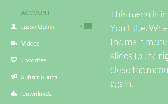
Codrops has shared a Simple Youtube Menu Effect Tutorial, which teach us how to recreate the little menu effect that you can see in the left side-menu on YouTube when watching a video (where it says “Guideâ€).
The menu is made of a little menu icon, a label and a list of menu items that appears when the label or menu icon is clicked. Once it’s clicked the menu icon slides to the right and the label moves up while the list items fade in sequentially. We’ll add some more style and effects to it in order to make it a bit more interesting.

Requirements: JavaScript Framework
Demo: http://tympanus.net/Tutorials/YouTubeLeftSideMenu/
License: License Free
This article recently appeared on BuildNewGames.com, a collaboration by the teams at Bocoup and Internet Explorer.
“Responsive design†is a fairly popular buzzword in modern web development. The idea behind responsive design is that an interface is designed and should be built such that it can be adapted to any technology, any screen format; some form of the interface should work just as well for an Android phone as it does for a 27†Apple cinema display. It’s a design that flexes and shuffles around content to match the assumed expectation of the user based on context; that context is defined by the technology, use case, and location. So, then, what happens as we build extremely interactive applications- that is, games- on the web? Often, we find ourselves conflicted; “do we support IE 7? Or 8? What about Opera? What about mobile? How about Japanese, or Hebrew?†Traditional approaches involve generating a minimum-requirements spec, where we limit the potential number of users in return for cheaper development and support costs.
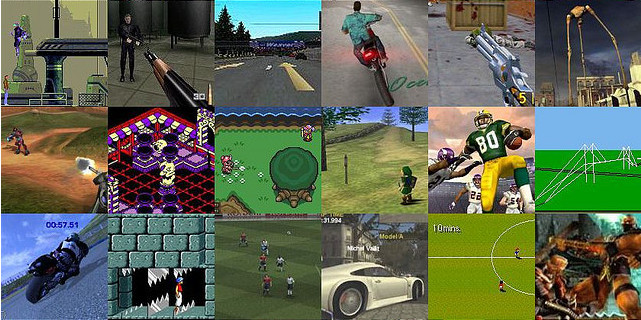
There is, however, an interesting and compelling way around this conundrum to engage a much larger market. We can shift around the problem entirely by providing an entirely new class of entertainment to our end user. What I propose is a progressively enhanced, responsively designed approach to web gaming that encompasses all devices, everywhere, by providing engagement across all levels.

This involves breaking away from the idea of building a game, and instead, building a lasting, engaging experience.
This isn’t a new idea; it’s simply subtle. Mass Effect, by BioWare, has launched campaigns that involve mini-games for the iPad 1. Many online games have official forums. EVE Online, by CCP Games, supports building offline social connections; many players in the same corporation talk together in voice chat, IM, forums, and meetups, allowing the chance for tremendously deep interaction without even loading the game client 2. Rich meta-game experiences keep players involved even while not actually playing the game, and often are the result of just a little bit of extra effort. All of these things are supported by the common infrastructure provided by the Internet. Read the rest of this entry »
This article recently appeared on BuildNewGames.com, a collaboration by the teams at Bocoup and Internet Explorer.
Until recently, performance of browser-based games for mobile devices has lagged significantly behind desktop performance. If you wanted to create a Canvas-based mobile game, performance was terrible and you needed to build your game around the limitations of the platform. Developing a usable game meant using tricks like scaling up from very low resolutions or doing partial screen updates instead of full refreshes, meaning your game design was limited by the platform’s weaknesses rather than your creativity.
Luckily, this has changed. Browser vendors are rapidly improving their mobile performance:
- iOS5 now ships with Nitro Javascript
- Chrome for Android browser is now available on Android 4 (Ice Cream Sandwich)
- Windows Phone 7 Mango launched IE9 mobile with hardware acceleration
All feature a GPU hardware-accelerated HTML5 Canvas element and both feature multi-touch support inside of the browser, a must for any but the simplest games. While Chrome for Android still have some significant work to do on Canvas performance, this now seems like an inevitability rather than a hopeful prayer.
Developing HTML5 games that work in the mobile browser comes with its own special set of requirements. You’ll first need to have an idea of the number of sprites you can push on the screen at once. Next you’ll want to maximize your game to the size of screen so that users don’t have to squint to play your game. Next you’ll need to add touch controls so the game will be playable without a keyboard. Finally you’ll want to consider adding a number of pieces of meta-data to allow your page to be used a home-screen application and have it show up with the right icon.
Performance Considerations
While mobile HTML5 game performance has increased significantly, you do still need to be aware of the limitations of the two dominant platforms: iOS and Android.
You have two primary options when building an HTML5 game: either build it with Canvas or use CSS sprites. For example, before iOS 5, you’d achieve much better performance in general using CSS sprites, provided you weren’t moving too many of them each frame. This was (and generally still is) the case with Android. Browsers have been optimizing the rendering of HTML elements for a long, so unless you are moving a full page’s worth of tiles and sprites, CSS sprites are still something to consider.
Now with hardware acceleration, Canvas performance has reached a level where where full screen action games at CSS pixel resolution are possible. Read the rest of this entry »
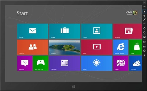
I’m currently working around the touch events of IE10 and even if I’m lucky enough to have a Windows 8 tablet, I was looking for a simpler way to do basic tests on my classical laptop without switching to the tablet each time. While looking for that, I’ve discovered several tips & tricks that may help you debugging the IE10 touch events in your code without even using a touch device. Nice side effect: the same approach will also help you to test & debug your responsive web design!
Pre-requisites: to follow this tutorial, you need first to:
1 – Download & install Windows 8 Release Preview on your machine: http://preview.windows.com
2 – Download & install Visual Studio 2012 RC Express for Windows 8: http://msdn.microsoft.com/en-us/windows/apps/br229516
The touch events model of Internet Explorer 10
If you don’t know yet how our touch implementation works, you should first read these 3 articles:
As a complement resource, you may have a look to the Pointer.JS library that mimics the IE10 model for the other browsers.
The Windows 8 Simulator to simulate touch
The Windows Simulator is installed with the development tools and is normally designed to help you testing & debugging your Metro Style Apps. You may learn a bit more details here: First look at Windows Simulator
Still, nothing prevents us to use it for debugging web applications running inside IE10 in the simulator. Let me show you how.
1 – Launch the simulator by launching the Microsoft.Windows.Simulator.exe located inside “Program Files (x86)\Common Files\Microsoft Shared\Windows Simulator\11.0â€

And click on the desktop icon.
2 – Launch IE10, navigate to the “Internet Options†and “Advanced†tab. Check that both “Disable script debugging (Internet Explorer)†& “Disable script debugging (Other)†are not checked: Read the rest of this entry »
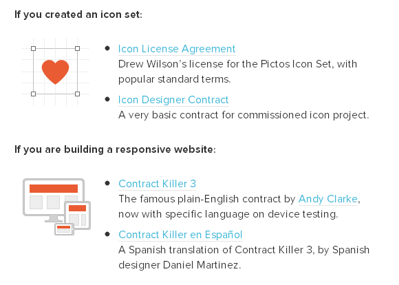
Docracy has collected the experience of many designers to provide a wide range of starting points for less experienced creative professionals, and to start a permanent free legal resource for the community. You will find a collection of some pretty useful legal documents there. You can have a look at this Collective Legal Guide For Designers.
There are contracts for creating an icon set, building a responsive website, starting a graphic design project, doing a small project with design and code, doing a BIG project with design and code, doing UX work, creating an infographic, redesigning a website, hiring a developer/designer to work on a project, making a mobile application and etc…

Source: http://www.smashingmagazine.com/2013/04/03/legal-guide-contract…
Swipebox is a touchable jQuery lightbox. It is a jQuery “lightbox” plugin for desktop, mobile and tablet. It supports Swipe gestures for mobile, Keyboard Navigation for desktop, CSS transitions with jQuery fallback, Retina support for UI icons, and Easy CSS customization.
It has been tested on Chrome, Safari, Firefox, Opera, IE8+, IOS4+, Android, windows phone. It is released under MIT License.

Requirements: jQuery Framework
Demo: http://brutaldesign.github.com/swipebox/
License: MIT License
There’s no doubt about it. Wherever developers look and whoever they talk to, mobile is at the top of the list. Talk to a C-level executive, and the conversation turns to mobile, and the question “How do I get me some of that?†comes up. Talk to other developers, and they tell you they’re targeting mobile devices. Mobile has become a big deal as smartphones have taken hold in the consumer marketplace.
In the years leading up to the current focus on mobile applications and devices, Web developers have been adding more and more client-side functionality to their applications. You can see this in the use of client-side JavaScript libraries like jQuery.
With the growth of the market for mobile devices, the ability to create applications that run across platforms is very important for developers and for businesses that are trying to keep their expenses in check. There are a set of applications, mostly in the area of content consumption (think Amazon.com), that run well in a mobile Web browser. Unfortunately, there are differences between Web browsers on various mobile devices. The goal of the recently introduced jQuery Mobile (jQM) library is to provide cross-browser support to allow developers to build applications that can run across the various mobile Web browsers and provide the same—or at least a very similar—user interface.

The jQuery Mobile library was introduced in an alpha release in the fall of 2010 and released to manufacturing in November 2011. At the time of this writing, the current version of jQuery Mobile is 1.1.1. By the time you read this, jQuery Mobile will almost certainly have reached version 1.2.0. The library has been embraced by Microsoft, Adobe and other companies for mobile Web development. In August 2011, jQM had 32 percent market share compared with other mobile JavaScript frameworks such as iWebKit and jQTouch. This market share is impressive given that it started from zero little more than 12 months ago, and the 1.0 release is the first officially supported release. Read the rest of this entry »
Today’s front-end developers don’t just need to understand how to write CSS, we need to know how to write it efficiently. And what “efficiently†means can depend on your project and environment. Perhaps you have a team with several members working in the CSS and you need an efficient way to work together. Or maybe you have a huge enterprise site and you need your CSS optimized for speed. You could even be working with a legacy system that restricts access to HTML, which means you need efficient selectors to effectively style elements without ids or classes. You might even face all these situations and more.
Whatever your goals for CSS are, the best way to reach them is to know your options, and that means understanding all the selectors available to you. Most of us are already familiar with id and class selectors, and I introduced you to the beauty of attribute selectors in “Understanding CSS Selectors.†But there’s so much more.

In this two-part series, I’ll look at the new selectors in CSS3, starting with structural pseudo-classes.
What’s a Pseudo-Class?
CSS pseudo-classes target elements that can’t be targeted with combinators or simple selectors like id or class. You use pseudo-classes to select elements based on their attributes, states, and relative position. For example, you are probably already familiar with pseudo-classes for link states: Read the rest of this entry »
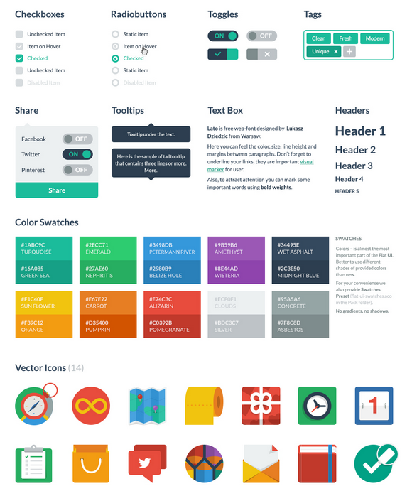
Flat UI Free is made on the basis of Twitter Bootstrap in a stunning flat-style, and the kit also includes a PSD version for designers. Flat UI Free contains many basic and complex components which are great for designers to have at hand: buttons, inputs, button groups, selects, checkboxes and radio-buttons, tags, menus, progress bars and sliders, navigation elements and more.
Colored, stylish icons can easily be modified and used in a wide variety of projects, as they contain original layers. Glyphs are also available in psd, html/css and svg formats. The kit also includes color swatches – no worrying over color choices here – with 10 colors that perfectly suit each other. Flat UI Free is made using the Lato typeface, which can be downloaded for free.

Requirements: –
Demo: http://designmodo.com/demo/flat-ui/
License: Creative Commons 3.0 License
If you haven’t been living under a rock for the past year or so, you know that responsive Web design is one of the biggest trends these days. Introduced by Ethan Marcotte, the concept is simple: develop a site using methods that enable it to adapt and respond to different devices and resolutions.
When I first learned of this, I was instantly intrigued — particularly with the notion of using media queries, which I immediately applied to my own freelance site. I even wrote an article about the process: “Respond to Different Devices with CSS3 Media Queries.†(I strongly encourage you to read that article before delving further into this one. Go ahead. I’ll wait.)
As a result of my first media queries endeavor, I quickly realized I was missing a key part of the responsive design equation: flexibility.
Challenges with Fixed Widths
My freelance site is a fixed-width design, meaning all the width, margin and padding settings are specified in pixels. Traditionally, this has been my preference when building sites because it’s easier and faster for me.
But when writing the media queries for my fixed-width site, those easier and faster aspects rapidly disappeared. Why? Because with a fixed-width design, I found that I needed extremely detailed and verbose media queries to adjust for every single pixel value in my CSS. I was basically creating an entirely new layout for every potential resolution. Not easy. Not fast. Not fun.
Then I had the pleasure of listening to Mr. Marcotte speak at In Control 2011. He discussed responsive design as a theory and then dove into practicalities, like the fluid grid. Read the rest of this entry »


