Jongmin Kim worked as a senior interactive designer / developer for over six years in South Korea. He has received multiple awards, including the Red Dot award, the IF award, the FWA award and the Webby award.
He always tries to “pursue a minus design rather than plus designs” and keeps in mind that “form follows function.” His style is minimal and clean, using the golden ratio and interesting typography. Form Follows Function is a collection of interactive experiences. Each experience has its own unqiue design and functionality. All the experiences are created in HTML5, the site works beautifully on both desktop and tablet.

Source: http://fff.cmiscm.com/
Thank you for all of the participants of Giveaway: $300 and $200 Worth of PSD2HTML Services. We are happy to announce the following winners. Congratulations. You will receive an email from PSD2HTML with instructions of getting your prize shortly.
1. Bradley won $300 worth of service
2. Eric Martin won $200 worth of service
WebAppers will continue giving away some really nice web development tools and resources to our readers. Please feel free to suggest what you would like for the next Giveaway under this post. Thank you.
Toolbar.js allows you to quickly create tooltip style toolbars for use in web applications and websites. The toolbar is easily customisable using the twitter bootstrap icons and provides flexability around the toolbars display and number of icons.
Toolbars can be attached to any element required. You can run as many toolbars as required. Toolbars are responsive and follow the element on resize. The implementation is pretty straightforward with simple options. It is released under MIT License.

Requirements: jQuery Framework
Download Link: http://paulkinzett.github.com/toolbar/
License: MIT License
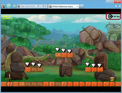
HTML5 features in modern browsers like Internet Explorer 10 make possible a whole new class of Web applications and gaming scenarios. This two-part article demonstrates how I’ve used some of these new features to modernize my last HTML5 game, HTML5 Platformer. In Part 1 of this article, I covered how to use CSS3 3D Transform, Transitions, and Grid Layout. In this article, I’ll show you how to use the offline, drag-and-drop and file APIs to implement some interesting new ideas.
Playing a Game in Offline Mode
The original version of my game worked only if your device was currently connected to the Internet. If you wanted to play to my fabulous game while you were on the train, in a taxi, or somewhere else without an Internet connection, you were out of luck—stuck without access to the awesomeness. And that’s too bad, because there really isn’t anything in my game that needs a live connection to the Web server once all the resources have been downloaded. Fortunately, offline APIs provide a solution for this in HTML5.
Read the rest of this entry »
Nowadays, there are lots of people using iPhone. And there are many app developers are looking for design resources for showcasing their apps. Using gesture icons for iphone app presentation is a great idea that can save a lot of your effort.
This set of iPhone Gesture Icons contain 12 iphone gesture icons in .AI format. Best of all, it is free to use. You can use them for presentations, sketches, storyboards etc. You can download the icons from the attachment file.

Requirements: –
Download Link: http://dribbble.com/shots/915713-Gestures
License: License Free
Photoshop Lady aims to collect the best and free photoshop tutorials around the internet. All of the high quality photoshop tutorials are categorized into 3D Effect, Abstract Effect, Drawing Effect, Photo Effect, Text Effect, Texture & Patterns and User Interface Design.
You can add your favorite photoshop tutorials simply by clicking “Add to Favoriteâ€, so that you can revisit them at any time. Photoshop Lady is updated daily. Please make sure you have subscribe to our RSS Feed as well, so that you can receive new high quality photoshop tutorials everyday.

Source: http://www.photoshoplady.com/
Top Drawer is a smooth dropdown menu for responsive web design. It is designed to demonstrate smoother reveal menus in small contexts using CSS3 rather than animating with JavaScript.
Tap the menu icon in the top right. The click event will assign the class of active to the drawer container which alters the translate value to bring it into view. Modernizr will detect whether the user’s device is capable of CSS transforms, if it isn’t we simply show and hide the menu after the button is pressed – no point in animating if it isn’t going to work smoothly.

Requirements: jQuery Framework
Download Link: http://www.jordanm.co.uk/lab/topdrawer
License: License Free
Future Insights Live 2013 is a 4-day event, comprised of one optional workshop day followed by 5 tracks and our hands-on labs over 3-days. FILive will discuss the future technologies, platforms, and business models YOU should be using and implementing to launch the next big thing.
No matter your level of ability, nor whether you are a designer, developer, product person or entrepreneur, this is the event for inspiration, education, and networking that you don’t want to miss.

Overview
- Coverage of the hottest web & mobile development, design, and business topics.
- World-class speakers from across the globe.
- Packed schedule: full day workshops, multi-track conference & hands-on learning labs.
- Incredible atmosphere: hundreds of like-minded web folk descending on Vegas
- All levels accommodated, something for everyone.
Workshops
- Designing an Elegant Mobile User Experience Across Multiple Devices and Platforms – Erik Loehfelm
- HTML5 & CSS3 Masterclass – Ryan McGinty
- Interaction Design Beyond the Wireframe – Lis Hubert
- Your money or your life? Designing a business that won’t kill you – Carl Smith
- Adding Realtime Event Handling to Any Website or App – Jason Lengstorf
- Getting Going With Node.js – Paolo Fragomeni
You can sign up with “WebAppers” discount code in order to get 10% off. Don’t forget to book your place before 1st Febuary 2013.
Kandan is an open source slick chat app for web developers. It is easy deploy to CloudFoundry, Heroku, dotCloud, etc. It supports Collaborative team chat, Unlimited channels, Embed formats for images and youtube videos with requests for others.

Requirements: –
Download Link: http://kandan.me/
License: AGPL License
Modern browsers like Internet Explorer 10 support the width and height properties of the W3C Working Draft CSS Device Adaptation. This gives Web developers a simple tool to control automatic content scaling across various window dimensions. In particular, it enables sites to easily adapt to Windows 8 browsing on touch-enabled tablet devices in the snapped view and in portrait orientation.
Auto-Scaling and When It Is Used
Most websites have prioritized optimization for a 1024 pixel wide window. This ensures a good user experience for a wide variety of displays when the browser is maximized. However, sites may not work well on new form factors like tablets and portrait screen orientation if they haven’t optimized for other window sizes as well. In particular, pages often clip or distort layout when viewed in a narrow width.
This narrow layout is particularly important in Windows 8, where the snapped view of the browser is in this exact state. This situation also occurs for portrait mode on slate devices due to the smaller form factor. Read the rest of this entry »


