Mobile App Website Inspiration: 20 Application Websites and Tips to Help You Design One
It may seem a bit curious that more than a few app websites are only given a cursory inspection by app owners. It is given before being largely ignored because visitors have gone elsewhere.
The reason for a given website may be completely valid in that it addresses a well-established need. It has a poor showing when it comes to converting visitors to users of the app in question.
The fault doesn’t lie with the app itself, especially if it’s one that a visitor will see as having value. It lies rather with the design of the website, a design which somehow fails to guide a visitor to the point where he or she decides to buy.
The design has to accomplish three things; attract a visitor, engage that visitor, and lead that visitor to the desired goal – selecting the product.
Creating a design that will accomplish these three things doesn’t need to be difficult; and it won’t be if you take advantage of these 5 simple tips.
5 Simple Tips for Creating High Quality App Websites
Tip # 1: Choose a spellbinding color palette
Beauty lies in the eye of the beholder. Not everyone will necessarily agree with what you consider to be a spellbinding color palette. You don’t have to please everyone of course, and you likely have a very good idea of what a color palette should consist of to attract attention.
Still, if you stick to the following 3 simple rules you should be dead right every time.
• The palette should highlight colors that immediately attract attention
• The colors you rely on most heavily should be on brand
• The palette you choose should visually support the website’s message
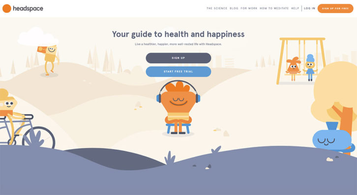
This Headspace example illustrates how pastel color touches can not only be as effective as bold, brash colors, but even more so. Pastel colors tend to give your site a lighthearted look; one that helps support the message.
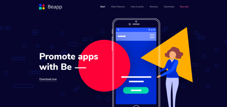
On the other hand this Be Theme pre-built website effectively uses an eye-catching palette of bold colors to attract and engage visitors.
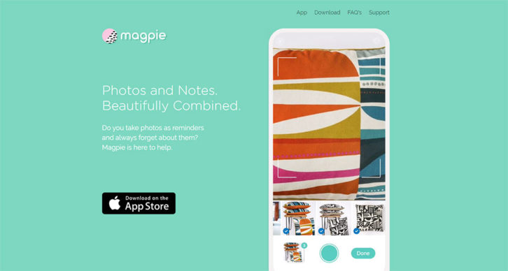
Pastels again: Magpie illustrates the result of creating a palette of visually memorable pastel colors that aligns perfectly with its brand.
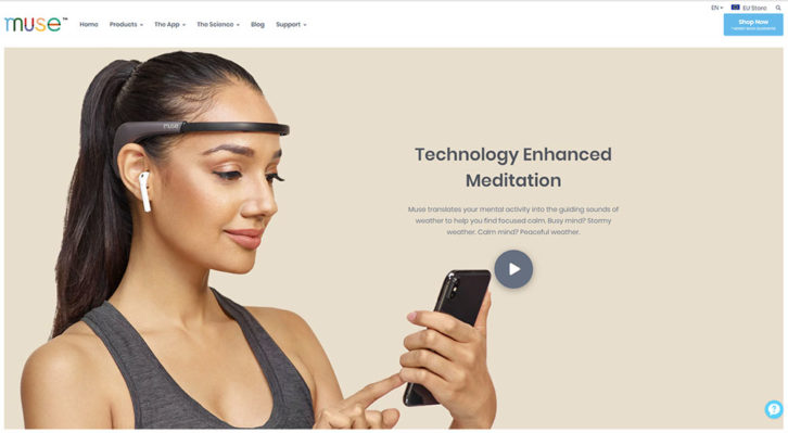
Natural, neutral colors have their place in the scheme of things as well. Muse’s color palette reinforces the message that their product line makes people more mindful and connected as they go about their daily lives.
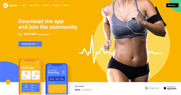
On the other hand, if your target audience is made up of physically active users, the BeApp2 color palette’s vibrancy should perfectly appeal to that audience.
Tip # 2: Feature ultra-sharp, crystal-clear product photos and images
This goes beyond merely trying to make web images as attractive as possible. It’s also about providing sufficient clarity so visitors don’t have to try to figure things out. They want the site to be crystal clear about how useful the app can be. Also, how easy or difficult it will be to use, and what makes it so different from 100 or more other apps of its type on the market.
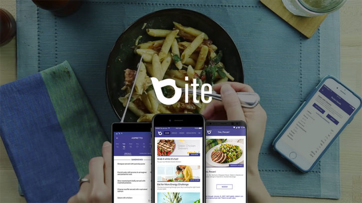
Bite for example, does a good job of clearly displaying how the app appears on a smartphone. At the same time giving a hint of how easy it is to work with.
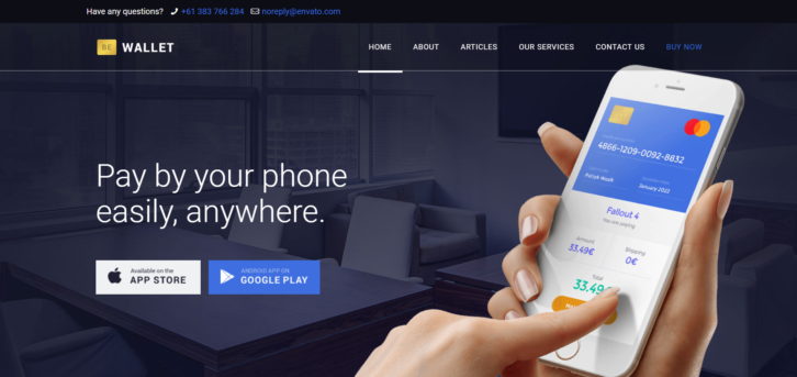
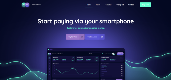
Or, take the BeWallet pre-built website. It provides an ideal foundation for building a website about a financial app (or apps). And, it’s an added bonus if you can show how easy the app is to work with.
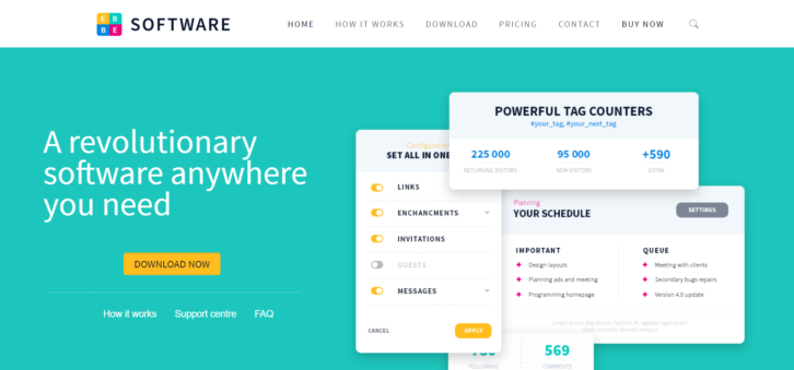
BeSoftware provides an excellent starting point for building a site that takes the visitor on a journey through the ins and outs of working with the app.
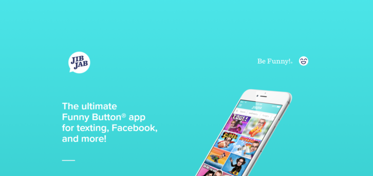
Before and after examples almost always provide a powerful, credible way to demonstrate a apps’ capabilities. JibJab does this to near perfection.
Tip # 3: Give visitors a clear picture of how the app works
This follow-on to the previous tip goes a step beyond clearly demonstrating what an app does and provides examples of how best to show how it works. Let the visitor imagine himself or herself actually using the app and you’ll likely have a sale!
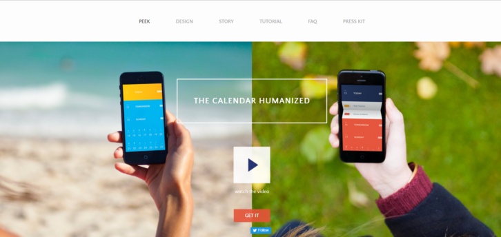
Video is an easy way to accomplish this and PeekCalendar’s hero section makes very good use of one.
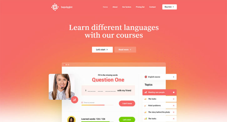
Although BePolyglot wasn’t designed with an app in mind, it demonstrates a great approach to previewing one.
BePay’s video is opened with a CTA button above the fold. Important extra tip: Always invite your visitor to watch the video. Most visitors regard a video that automatically starts when you bring up the page as an intrusion.
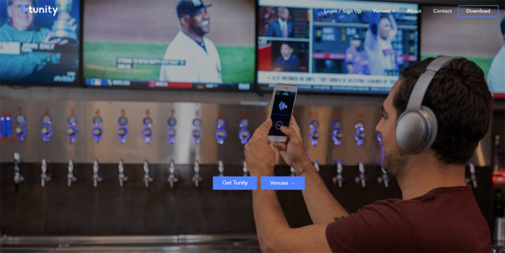
Tunity’s approach is to use sliders to show in great detail the various workings of an app. It is like a mini-tutorial that visitors will more than likely appreciate.
Tip # 4: Don’t be afraid to be over-generous with your use of “white†space on app websites
White space is a design element that almost begs to be used excessively. “More is better†often applies here since white space has the effect of drawing attention. Also, highlighting other design elements of a page are making it that much easier for a visitor to focus on what you believe to be important.
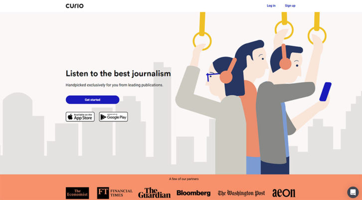
Curio does an excellent job of white space usage. Note how the heading, small as the font size is, practically jumps from the page.
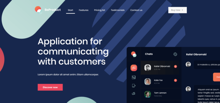
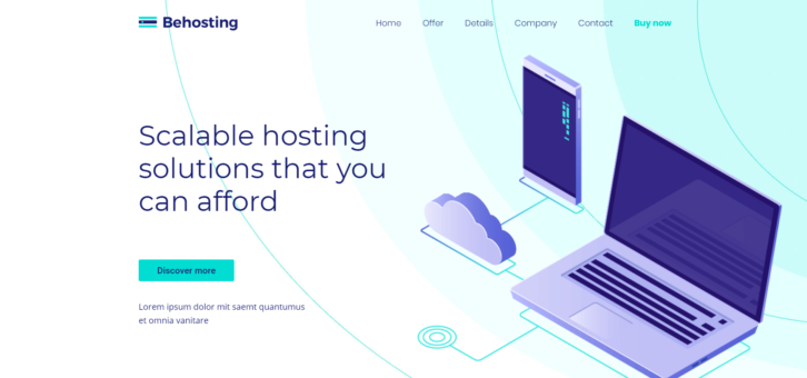
The BeProduct4 or BeHosting2 pre-built websites have the same clean, fresh effect. Note that “white†space can be either light or quite dark.
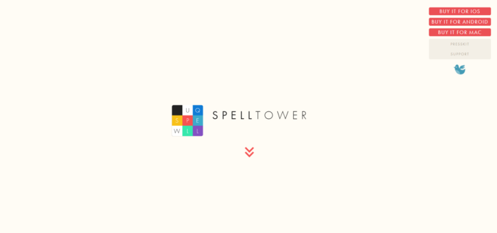
SpellTower shows how far you can go in using vast amounts of white space. Although most of the page is white space, it’s use is by no means excessive. The user knows precisely what to do next.
Tip # 5: Use CTA designs that refuse to be ignored
A CTA button can make 3 things happen, and 2 of them are bad. It can send a user to the wrong page or section. It can do nothing at all if it’s not easy to locate, or it can send your user to the exact place you want him or her to go next.
You obviously want to avoid sending someone to the wrong place, but that’s outside the scope of this commentary. What you want to do is design a CTA button that is not only impossible to miss, but makes a visitor feel obliged to click on it.
Think bold and beautiful.
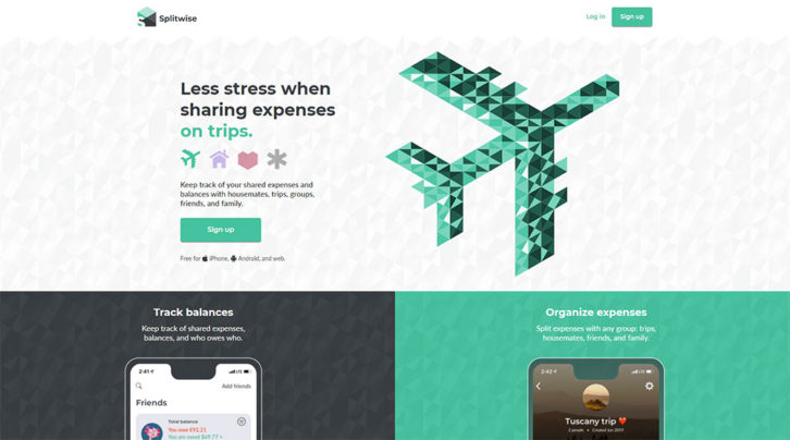
The Splitwise CTA button is not hard to find. The flow is to the headline and from there to the sub-headline and the button.
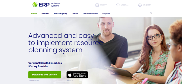
A bright green color does the trick here. BeERP uses it to draw attention to the primary CTA button. A secondary button is slightly plainer.
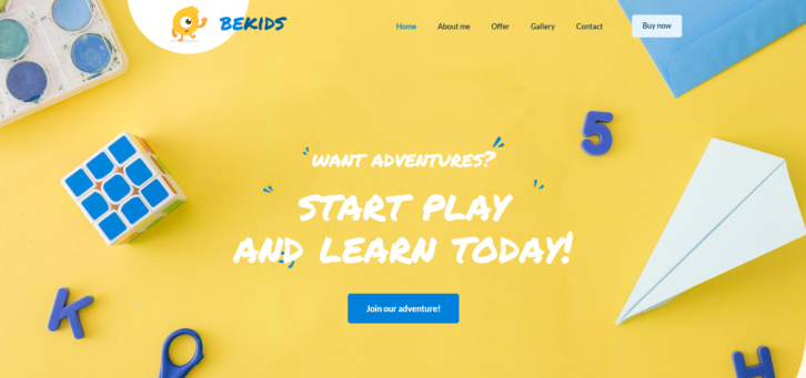
BeKids show that it can be OK to use the same color for your CTA button as you’ve used in other visual elements. It still stands out!
Conclusion
Follow these 5 tips and you should expect little trouble in creating an app website that’s more than capable of turning visitors into customers.
You’ve decided on a color palette that attracts attention. Visitors will find your use of clean imagery and generous use of white space engaging.
Clearly illustrate what the app does and how it works will keep those visitors engaged. It will lead them to your bright bold CTA buttons and to conversions.
If your goal is to create as many app websites as possible without risking work overload and the threat of burnout, may we suggest checking out Be Theme’s gallery. This gallery has nearly 500 professionally-crafted pre-built websites. These pre-built websites are customizable, functional, visually impressive, intuitively navigable. They provide you with the solid foundations you need to create one attention-getting app website after another.


