
5 Critical Elements You Can Use to Build Award-Winning One-Page Websites
Have you built a one-page website before? Then, you already know some of the challenges involved. Although, not necessarily how to overcome them. If you haven’t, and you think the task should be far easier than building a multiple-page site, you’re in for a surprise.
It takes a great deal of planning to successfully stuff a whole lot of information into a single page. You need to do it in a way that won’t scare visitors away.
The one-page website-building guide presented here is centered around 5 critical design elements. Depending on how they’re used, or not used, they can make or break your design.
Hint: Have you ever lost your way while scrolling through a long-form one-pager? Then, you’ll more than likely take these 5 critical elements to heart.
5 Critical Elements You Need to Be Aware Of – and Heed
Â
#1 The GOAL: Identify the Website’s Goal and Work Toward that Goal
Maybe you have A concept in mind for a cool one-page website. But until you define the website’s goal and what you intend it to accomplish, your concept will remain just that.
Before you even think about starting the design process you need to have a goal in mind. Is your goal to:
- To sell something
- To present your portfolio
- To announce an event
- Or something else entirely?
Having done that, you can start working on a design that won’t chase visitors away before they take the action.
What will drive them away? Slow page loading is one culprit. Be careful not to use special effects like parallax that often slow things down.

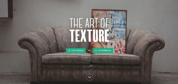
This website’s interactive effects were chosen because they won’t drag down its page load speed.
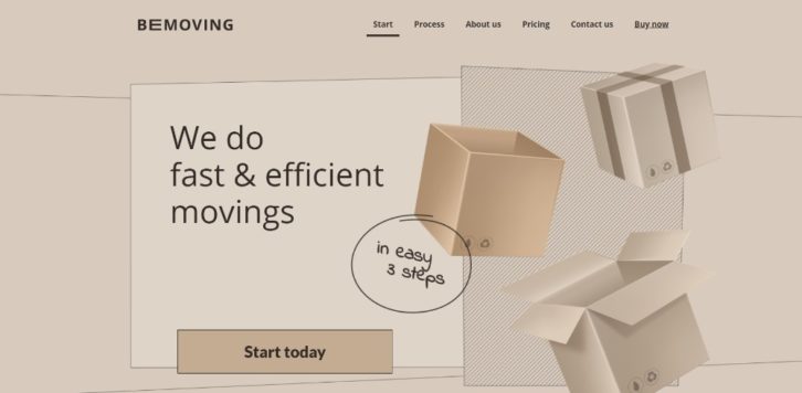
This BeTheme pre-built one-pager’s seemingly dynamic image is actually a static image.
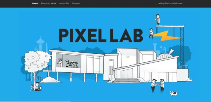
Another example of where tiny animated items liven up a page without slowing anything down.
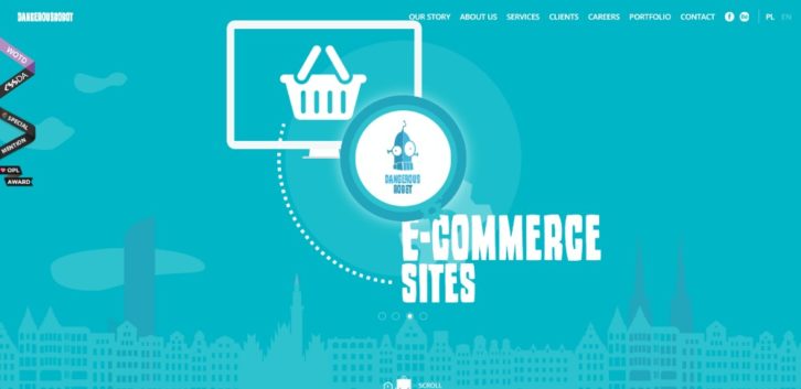
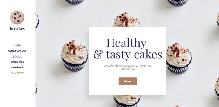
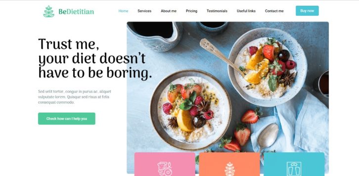
This pre-built website is a good example of how a page’s fresh look alone can make a sale.
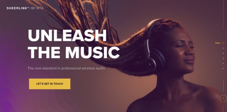
Large images and sliding panels can engage users without affecting website performance.
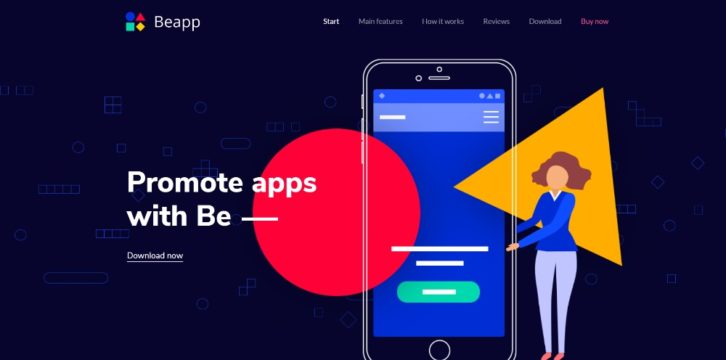
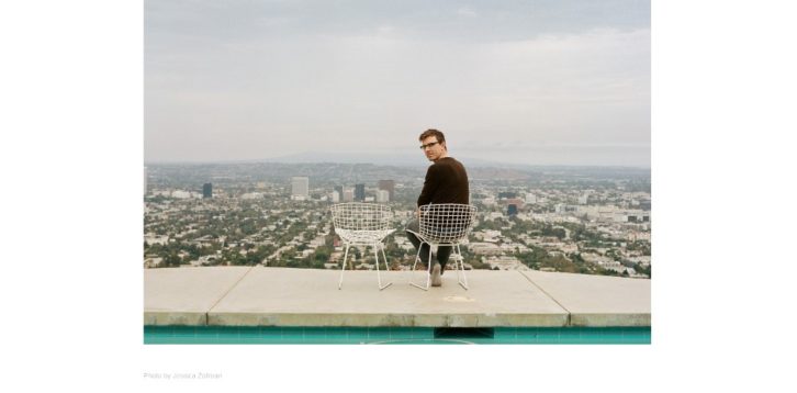
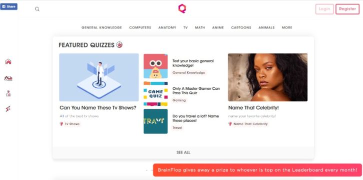
You don’t need a long-winded technical discourse to promote an app. A genuinely cool presentation like this one will do the trick.
#2 TEXT: Keep It Minimal & Make It Easy to Read
You need to keep text to a minimum on a one-pager if you also want to keep visitors engaged.
Rely on bold headlines, short paragraphs, and bullet lists. This is instead of clunky blocks of text. The latter serve no purpose other than offering visitors an excuse for leaving.
This page is so entertaining you’ll want to go through it twice.
An example of what neat organization can accomplish.
All the key information is above the fold; bullet lists help keep the message concise.
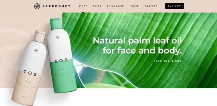
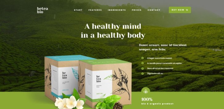
Another example of how large attractive images can be selling points when accompanied with appropriately-placed text.
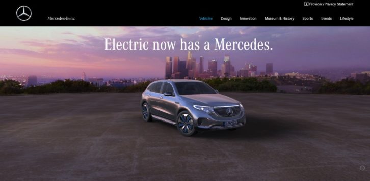
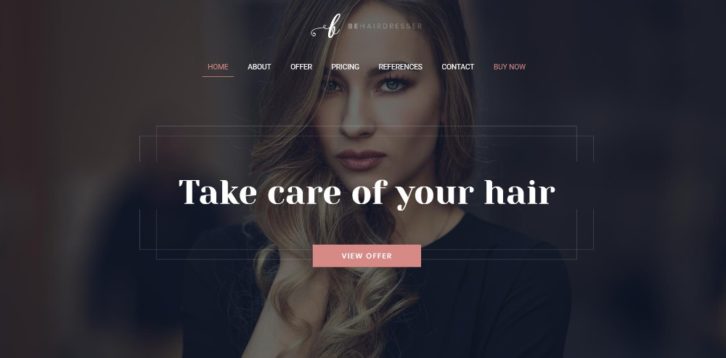
A website for a vehicle with the stature of a Mercedes can focus more on high quality imagery and less on text.
#3 VISUALS: Identify the Right Patterns & Use Negative Space Wisely
Knowing how people generally scan a page can help you knock out a solid design. They read text in an F pattern and view images in a Z pattern.
White space is a great way to organize content. It helps users navigate, and can gently direct them toward the website’s goal.
An excellent example of how the use of white space can provide a sense of order.
White space is the canvas. The content is wildly creative.
The white space in this pre-built one-pager causes the different sections to appear to pop out.
Here’s how you can use several different design principles to the max to create amazing effects.
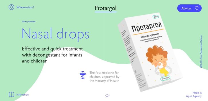
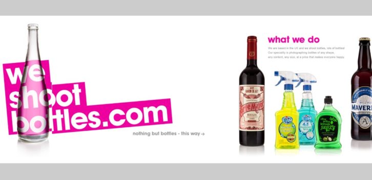
Pages promoting nasal drops rarely excite. This one can do so thanks to an ingenious combination of slides, animations, and white space.
#4 NAVIGATION: Make It Easy to Navigate & Entertaining to Scroll
The longer your long-form one pager becomes, the more attention you have to pay to the navigation.
Alternate navigation is the recommended approach. It allows people to jump quickly to a section they’re interested in. Auto-scrolling navigation is often the best choice. It only requires a single click, after which the user gets to watch the site self-scroll.
Several examples of engaging, user-friendly navigation:
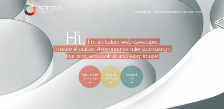
3 different auto-scrolling links are used in this designer’s website.

Be Game’s navigation experience is both practical and entertaining.

Three things stand out, the layout structure, the color scheme,and the ability to scan the page with 3 mouse scrolls.
A menu on the top and one on the left can help you navigate a site quickly.
#5 CALL TO ACTION: Identify the Correct CTA & Don’t Be Afraid to Use It
This ties into the #1 element, the website’s goal. Don’t hesitate to use CTA buttons to bring closure.
The beauty of building a one-page website is you generally have but a single goal or action to contend with. If you’re presenting a portfolio a single CTA button will usually suffice. If you’re offering several products, you may need several buttons.
This pre-built website has two CTA buttons, one is above the fold and the other is in the menu.
Two CTA buttons placed above the fold let users select what they want to see.
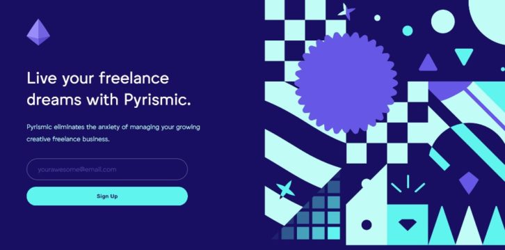
Pyrismic’s site uses a simple opt-in form with a bold CTA button.
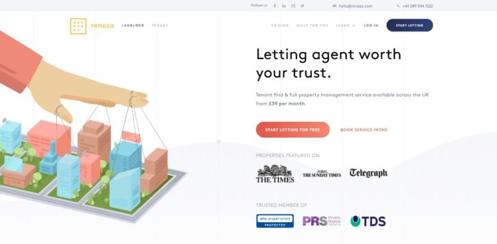
Reneza may not mess around when working with CTA buttons but they do use them judiciously and with a good choice of colors and text sizes.
Wrapping It Up
Now, you’ve been introduced to the 5 critical elements of one-page websites. You also know how you can use them to create an engaging UX, all you need to do is practice them until you’ve mastered them.
They may seem pretty straightforward and simple at first glance and in a sense they are. But when you start trying to mix them into a long-form one-pager, you’ll discover it can be quite a challenge.
There’s nothing wrong with taking a shortcut however if it will lead you to the same results.
Pre-built websites already have these basic elements nailed down. A good pre-built website resource is Be Theme. It has a huge library of over 60 one-pagers and 400+ pre-built websites in total. Simply choose one to use and customize it to fit your needs.