
Business Websites Examples and Tips – Where User Experience and Conversion Rate Optimization Meet
Small business owners are not always savvy as how best to present their products or services online. The result, is too many business websites that look like most other websites, or websites which contain the right information, but it is not presented in a way that will attract and engage a visitor.
Professional web designers like you should do more than graphics and layout design, or create websites that function as expected.
You should create websites that foster excellent user experiences, and websites that are designed to optimize, and where possible, maximize, conversion rates.
In order to do this, you and your clients, have to know a website’s audience, and they have to know how to market products and services instead of merely showing or describing them.
Web Designers Should Be There to Help

You need to be aware of the fact that not all of your clients understand, or are prepared to handle, online marketing decisions. While these same clients want their businesses to be user centric, they do not always know how to make that happen in an online environment.
- Web design needs to revolve around the user, rather than the website owner, and everyone on the design team needs to understand and buy into this concept.
- Every business niche has its own set of rules. There is no such thing as a “one size fits all†business website. The basic UX rules are designed to draw in and engage visitors.
- Certain commonplace rules, e.g., menu location, or shopping cart location, should be respected. Flashy design is rarely appropriate, as it tends to drive away more visitors than it attracts.
- Content is still king, but only if used wisely. Content should never confuse the viewer. Instead, it should clearly demonstrate a business’s uniqueness.
9 Examples of Beautiful Pre-Built Small Business Websites
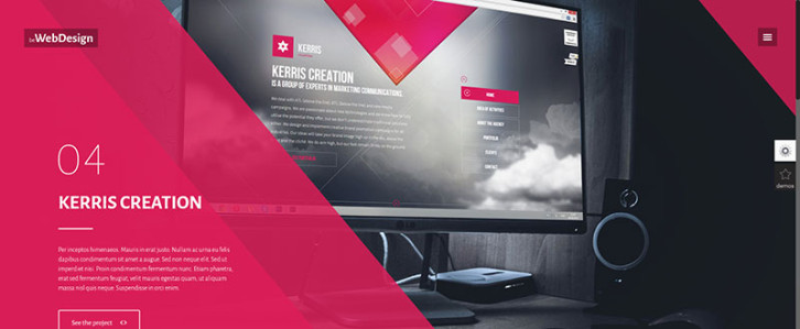
Image is all important for digital or web design agencies, but the look and feel of the website in its entirety is no less important; as is illustrated in this first Be Theme example. Visitors who are given a great first impression will naturally stay more on a page.
Look and feel can also be defined in terms of the user interface, which includes smart menu design, well organized service areas, and engaging portfolios. Take note of the way in which an agency’s unique value proposition (UVP) is presented in these two examples; and in the following 10 examples as well.
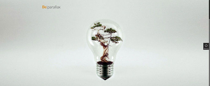
This delightful portfolio image is stylish, modern, and unique in its presentation. This page illustrates the power of white space. There are no words except the small title, yet the white space speaks volumes. It practically begs you to explore further!
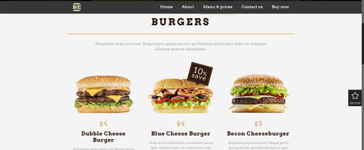
This Be Theme-designed page makes the common burger a thing of beauty. It is a page any restaurant-owning client should be proud of. It is both a mini-portfolio and a mini-menu. The menu is not overly conspicuous. It tells the viewer where to go to look for other restaurant offerings and prices. This pre-designed website will can make almost any viewer hungry for a burger.
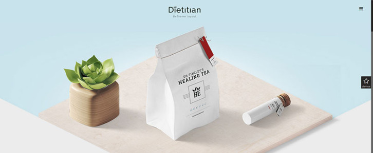
This is another example of a simplistic yet beautiful design that says a great deal, using only a few words. The way open space is used tends to draw the visitor to the center. There is much more to this Be Theme website than this page, and you are invited to view the demo for the total experience.
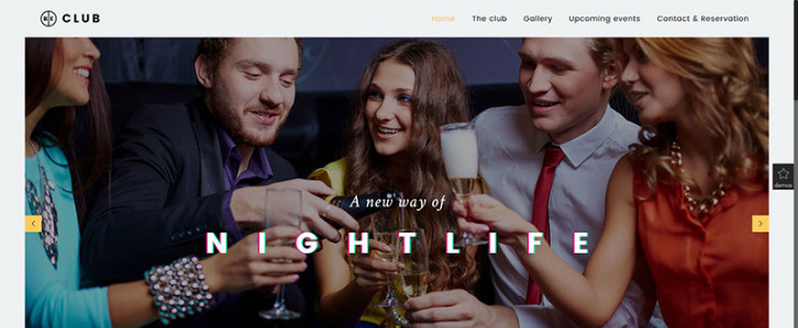
This Be Theme Be Club website projects good times and atmosphere. It presents an open invitation to visit or join the club, and it points out important things of interest to the viewer, such as upcoming events.
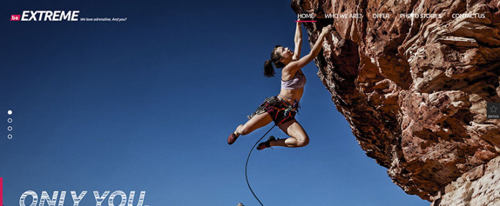
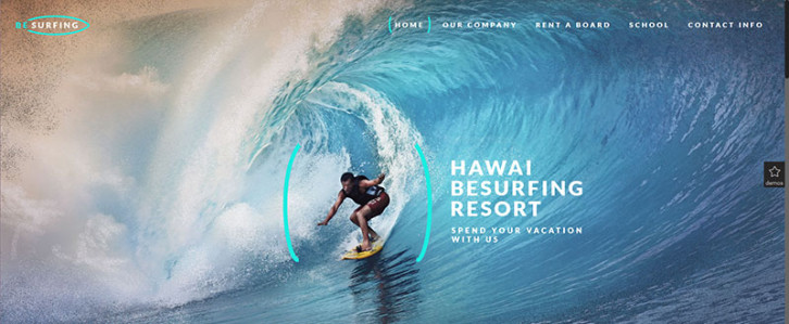
Be Extreme and Be Surfing
These two examples illustrate intense experiences. They present powerful calls to action to outdoors and sporting enthusiasts.
This design is clean, attractive, and luxurious. The image is large and appealing, yet the clever use of white space keeps the overall design from being too busy. The menu is prominent, but not distracting.
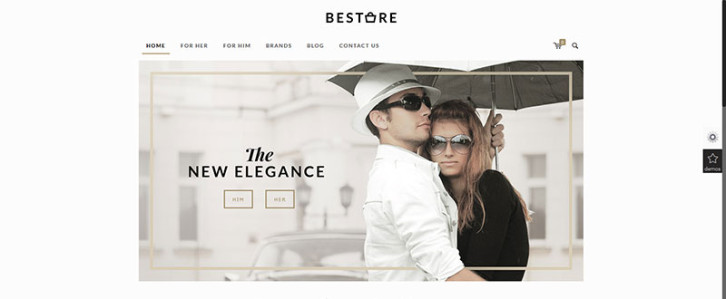
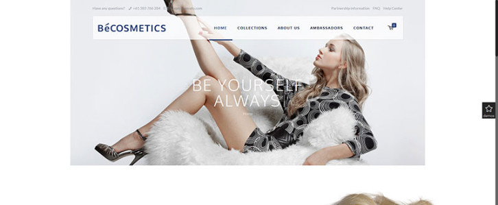
This theme is the ideal solution for an online clothes shop. The design is elegant, and the white space, actually a faint background image, makes the central image even more realistic. Note the menu. It features a blog page. The blog is a marketing tool that is also included to further engage the visitor.
Be Theme – And the Pre-Built Websites People Love
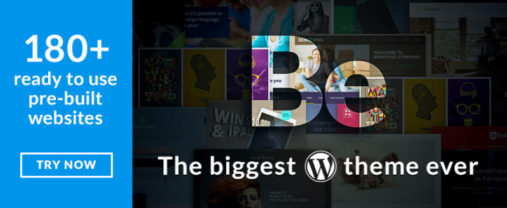
These 12 examples represent less than 10% of the total number of Be Theme pre-designed website offerings. Once you select Be Theme as your WordPress theme of choice, you have 180+ to choose from, with new ones added every month.
More than half of these websites come with multiple pre-built pages, which makes creating a small business website faster and easier, and ensures you won’t leave important pages or sections out.
Given the large selection of topics, plus the fact that these pre-built websites are easily customizable, building a website that features an awesome design is an enjoyable experience.
Check out this video and see how easy it is to install and edit a Be Theme pre-built website:
Here, you will have an opportunity to browse through the entire 180+ pre-built website collection, view several of the demos, and explore the powerful core features Be Theme brings to the table.