
Responsive Image Breakpoints Generator
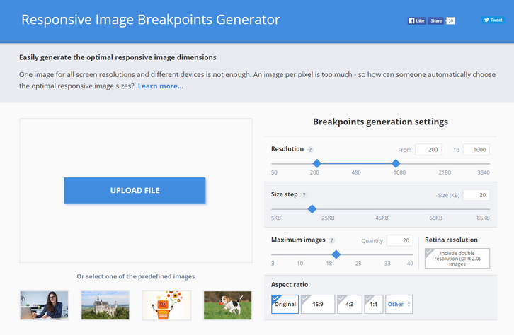
One image for all screen resolutions and different devices is not enough. An image per pixel is too much – so how can someone automatically choose the optimal responsive image sizes?
Responsive websites, even the most modern ones, often struggle with selecting image resolutions that best match the various user devices. They compromise on either the image dimensions or the number of images. It’s time to solve these issues and start calculating image breakpoints more mathematically, rather than haphazardly.
Responsive web design requires developers to determine the image dimensions that best fit their website. This breakpoints generator tool helps developers automatically find the optimal image sizes needed for the best viewing experience in web and mobile apps on a variety of screen sizes.
Common responsive image solutions tend to generate images based on a fixed set of image width values, disregarding the actual saving in file size bytes. To solve this problem, Responsive Image Breakpoints Generator uses Cloudinary’s advanced algorithms to easily generate best matching breakpoints for each uploaded image.
The algorithmic concept is to find image width values that offer a significant reduction in file size. Images are analyzed to find the best breakpoints on an image by image basis, rather than creating all possible image resolutions, and enables developers to easily create ‘picture’ and ‘img’ HTML5 elements based on the calculated breakpoints.
Requirements: –
Demo: http://www.responsivebreakpoints.com/
License: License Free


