
Beginner’s Guide Into Responsive Web Design
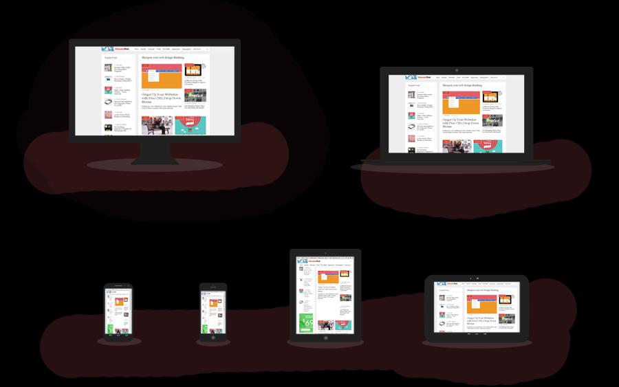
If you’re reading this blog post probably you’re the last person in the world who decided to learn responsive web design. Well it’s never too late to learn. Here you will learn the bare essentials of RWD, and after reaching the end you will know where to start and what you need to do. So let’s scroll.
To understand the principles of responsive design you need to know three things that make the basis of this design principle. The first thing is the “viewport” tag.
Meta Tag Viewport
Most mobile browsers scale the HTML page so that it will fit on the width of the full-screen devices. Using the tag “viewport” you can eliminate such behavior of browsers. Meta tag “viewport” with values listed below tells the browser to use the width of the window unit and disable the initial scaling. Include this meta tag into the <head>.
There have always been certain troubles with Internet Explorer browsers. So when it comes to RWS once again you will understand why everyone hates so much IE. IE8 and older versions do not support media queries. You can use a specially designed java-script or media-queries.js respond.js to add media query support in IE. To make this work you need to use conditional comments, as shown below:
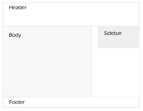
HTML Structure
Here is an example of a simple page layout with header, content, sidebar and footer. The header has a fixed height 180px, main block width – 600px, sidebar – 300px.
Media Queries
CSS3 Media Queries are the basis of any responsive website or responsive website template. These are the mapping rules for a given width of the window. Rules that every browser is using.
Following set of rules will apply if the window width is 980px or less. The widths of all containers is set in percent what will make them elastic.
980px or less
@media screen and (max-width: 980px) {
#pagewrap {
width: 94%;
#content {
width: 65%;
#sidebar {
width: 30%;
}
}
Next you need to set rules for 700px wide screens and smaller, specify the width – auto for #content and #sidebar and they will be displayed for full width.
700px or less
@media screen and (max-width: 700px) {
#content {
width: auto;
float: none;
#sidebar {
width: auto;
float: none;
}
}
For screens 480px or less (mobile screens), for the #header specify height value – auto, change the font size from H1 to 24px and hide the #sidebar.
480px or less
@media screen and (max-width: 480px) {
#header {
height: auto;
}
h1 {
font-size: 24px;width: auto;
}
#sidebar {
	display: none;
}
}
You can create as many media queries rules as you need. The essence of media queries is to apply different CSS rules for the formation of different layouts for a certain width of the window.
These rules can be specified both in the main css file, and in the additional.
Ok, you’re already familiar with basic principles of responsive design now you can proceed further. Probably you’re already familiar with a resource called lynda.com there you can find video tutorials for any possible activity. And we’ve picked one in-depth course that covers all possible aspects of responsive web design.
Creating a Responsive Website Design with Chris Converse
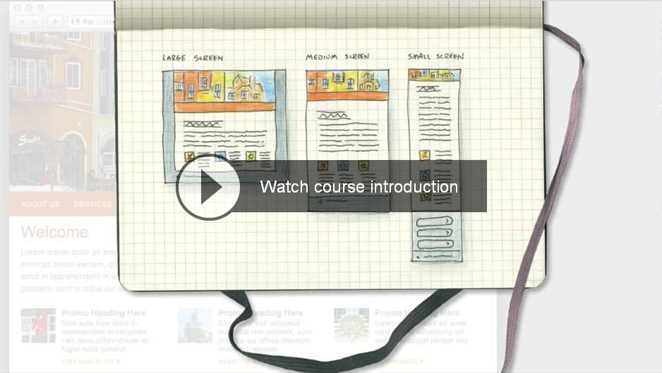
In this course you will find how to make your website more readable and efficient across huge amount of screen resolutions.
This course will take you from from start-to-finish of rwd designing, from comping your ideas in Photoshop, to setting up the HTML page and containers, to styling established elements for small, medium, and large screens.
You may ask why did we choose this video course? The answer is simple: it’s divided into twelve parts which in their turn have sub-items. The information is presented in a clear and precise manner what is just perfect for the starters.
* * *
And here is one more important thing any website owner can live without. That’s a responsive email design. If you are sending a newsletter once in a while you need to cater interests of your subscribers and make it possible to read your email using any possible device out there.
Creating a Simple Responsive HTML Email
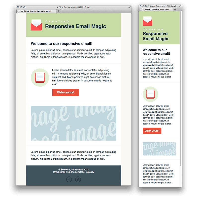
In this tutorial you will how to create simple but really stylish responsive HTML email that’s compatible with every email client.
* * *
Create a Responsive Website Using HTML5 and CSS3
This is another one complete A to Z tutorial where you will find how to code a responsive website from a scratch.
* * *
Responsive Web Design In Photoshop – A Mindset Not Just Technique
In this tutorial you will learn how to design in Photoshop with a responsive mindset and grid at your disposal.
* * *
Responsive design tutorial: Creating fluid images
If your site is already responsive than you need to add one more thing to make it complete – that is fluid images. Following the detailed explanations in this video you’ll be able to make it right.
* * *
Create Flat UI Design Style Website Now With This Step By Step Tutorial!
In this video tutorial you will learn how to design a flat ui style website page. Almost an hour long free video tutorial. Some people may find flat web design boring while others totally love it. It puts more emphasis on the content and it’s very flexible, which is really ideal for responsive web design.
* * *
In case you feel that something is missing, you can check out the following responsive web design tutorials. Compiled by true professionals, these guidelines will come in handy for various purposes, from building a responsive site from scratch to designing responsive thumbnail galleries and menus.
* * *
Responsive Web Design Guidelines and Tutorials
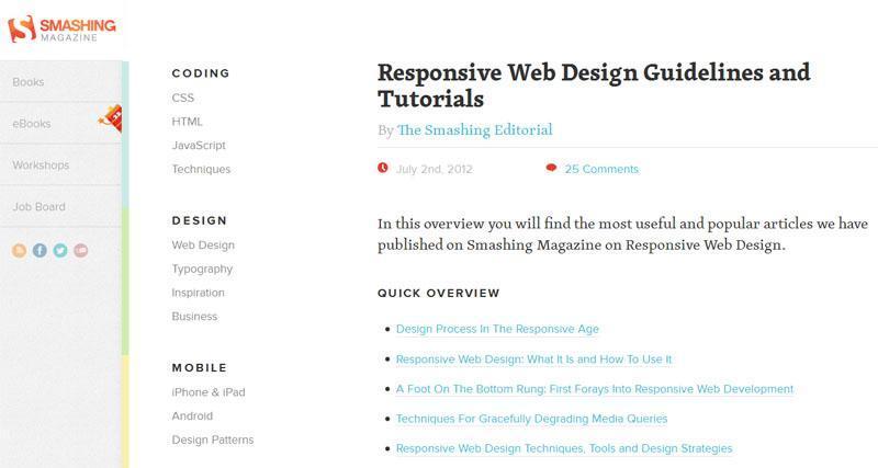
A useful collection of tutorials dedicated to the mentioned web design trend is available on smashingmagazine.com. This resource comprises many articles that cover the following aspects of responsive design: basics, techniques, tools, strategies, content prototyping, usage of CSS3 media queries and many other issues.
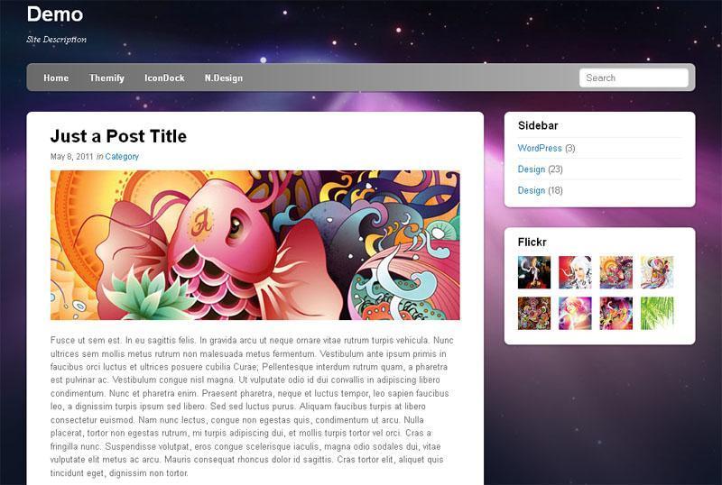
Beginner’s Guide to Responsive Web Design
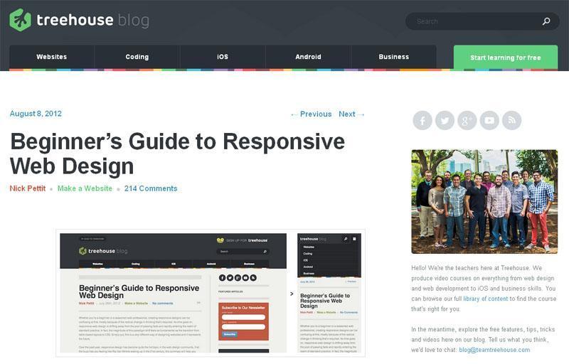
Everyone who is in search of an easy tutorial for beginners shouldn’t ignore the one accessible on blog.teamtreehouse.com. Here, you’ll find anything from basic notions of responsive design to fundamentals of media queries and fluid grids.
Responsive Web Design: A Visual Guide
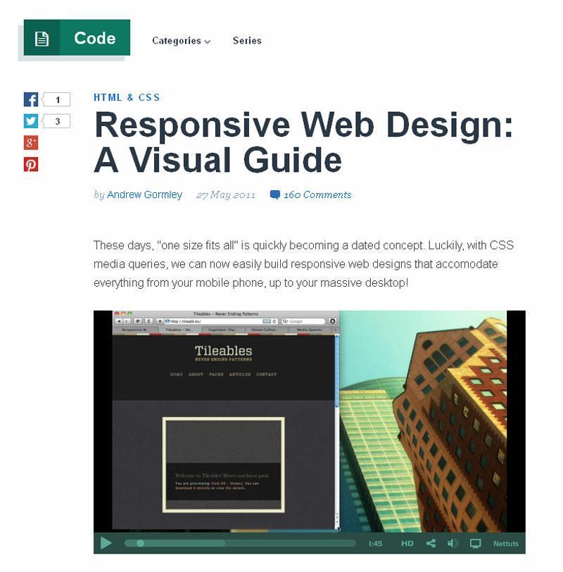
If you like learning new things by means of educative videos rather than texts, you’ll definitely appreciate this tutorial recorded by Andrew Gormley, a talented designer interested in emerging web technologies. It will take you less than half an hour to master the main principles of building responsive web designs.
Braindump on Responsive Web Design
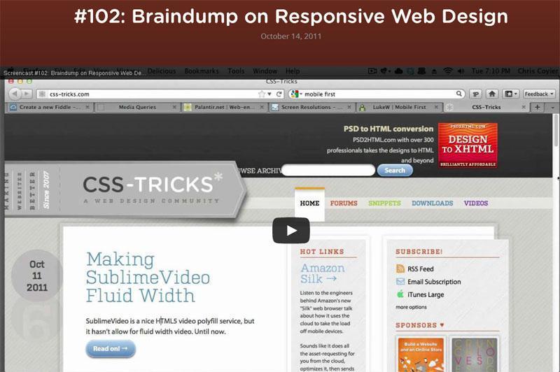
Another great video tutorial that lasts around 25 minutes is provided by Chris Coyier, a skillful designer, writer and podcaster. The author informs of the responsive design essentials and complements his info with striking examples, related sources, and tips.
Build a Responsive Site in a Week: Designing Responsively
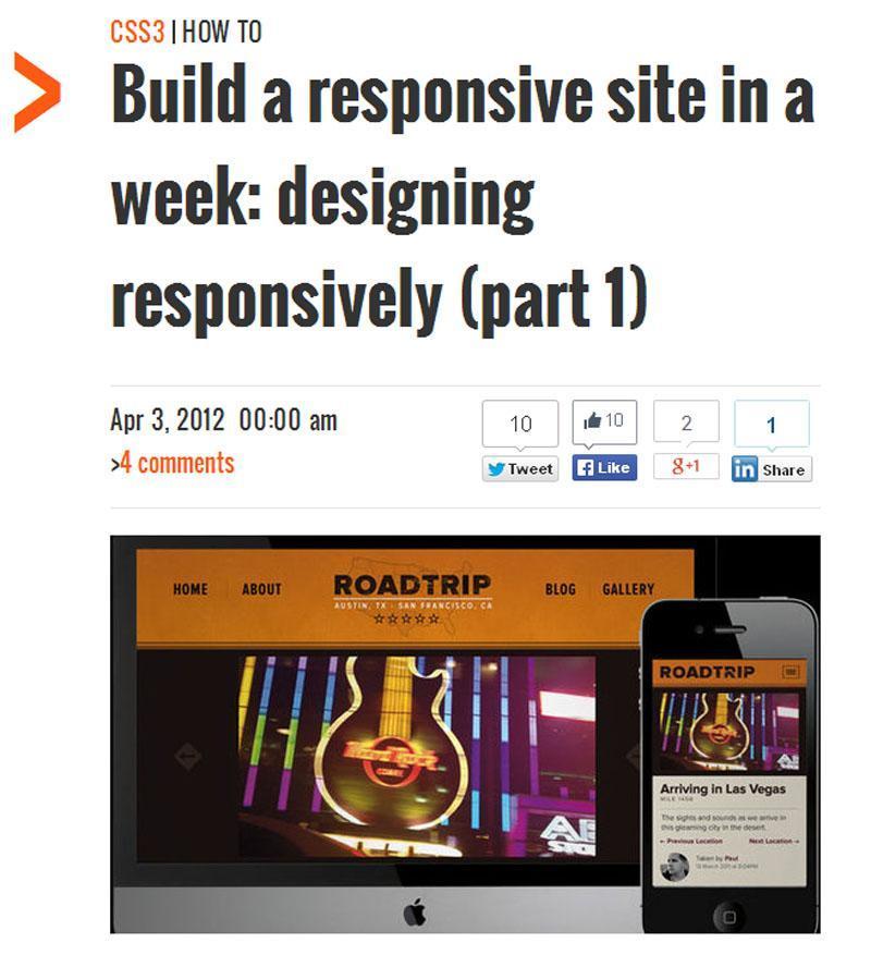
This series of five tutorials compiled by Paul Robert Lloyd, a specialist in interaction design, will come in handy for everyone who needs a smart guide through the process of developing a responsive site. After completing the course, you’ll learn how to work with media queries, convert static web pages into fluid ones, embed visuals into responsive layouts, and many other things.
How to Design a Mobile Responsive Website
The following tutorial is recommended to everyone who wants to build a site from scratch. Provided by a web designer with a 13-year-experience, it covers benefits of responsive platforms and key stages of creating one.
Create a Responsive Web Design Template
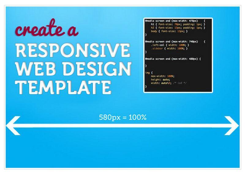
Here’s another brief tutorial that will teach you how to develop a responsive web template that will have a flawless look on screens of desktops and mobile devices. It’s written by Harry Atkins, a freelancer involved in web, graphic and 3D spheres of web design.
How to Turn Any Website into a Responsive Site

The tutorial created by Rochester Oliveira, an expert in WordPress and FrontEnd issues, explains how to add responsiveness to the site layout and its elements. To facilitate the whole process, the author noted several plugins that will be of great use for your undertaking.
Responsive Web Design with CSS3 Media Queries
Reading this tutorial, you’ll find step-by-step instructions on designing a responsive web template with HTML5 and CSS3. To assist you in better understanding, this resource features demos of designs before and after implementation of media queries.
Responsive Horizontal Layout
One of the main concepts to learn is creating a responsive horizontal layout with a few scrollable content panels. Proceed to tympanus.net, and you’ll find easy guidelines on how to fulfill the mentioned task. This tutorial is a merit of Mary Lou, a freelancer passionate about interaction design.
HTML5 Responsive-Ready Contact Form with JavaScript Detection
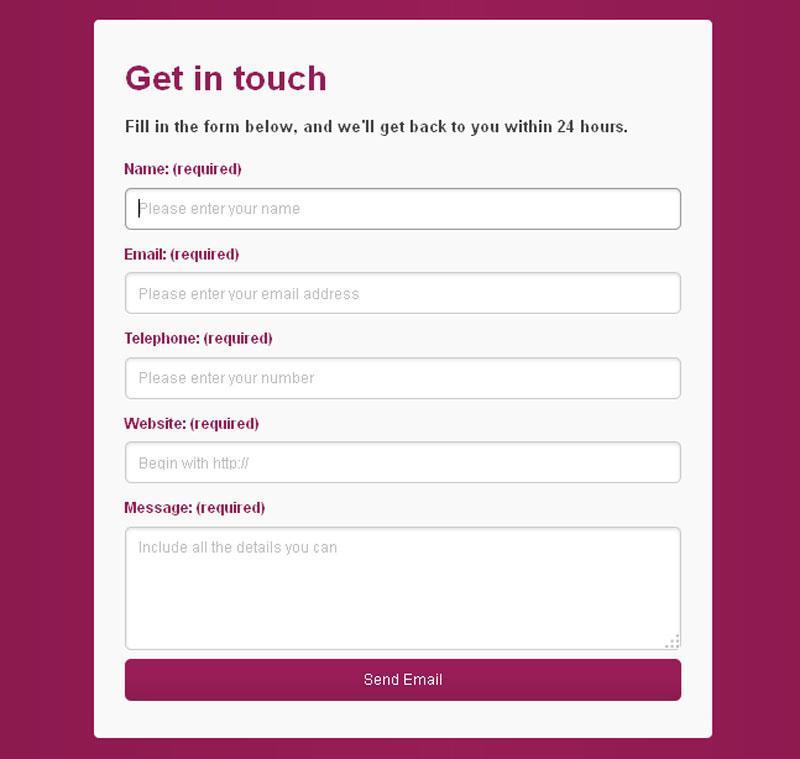
The main call-to-action tactic is definitely reflected in a contact form, that’s why it’s important to make it responsive in order to reach users of mobile devices. And Todd Motto, a true pro in web development, will help you dramatically in this task. Due to his tutorial, you’ll be able to design a responsive contact form in no time, which will bring you one step closer to prosperity of your business.
Coding a Responsive Resume in HTML5/CSS3

Would you like to design an online resume that would look awesome on screens of any resolutions? Then, this tutorial by Jake Rocheleau, a freelancer focused on contemporary trends of design web, is just the job for you. Here, you’ll learn how to build a responsive layout for online CVs by means of HTML5 and CSS3.
How to Create a Responsive Navigation
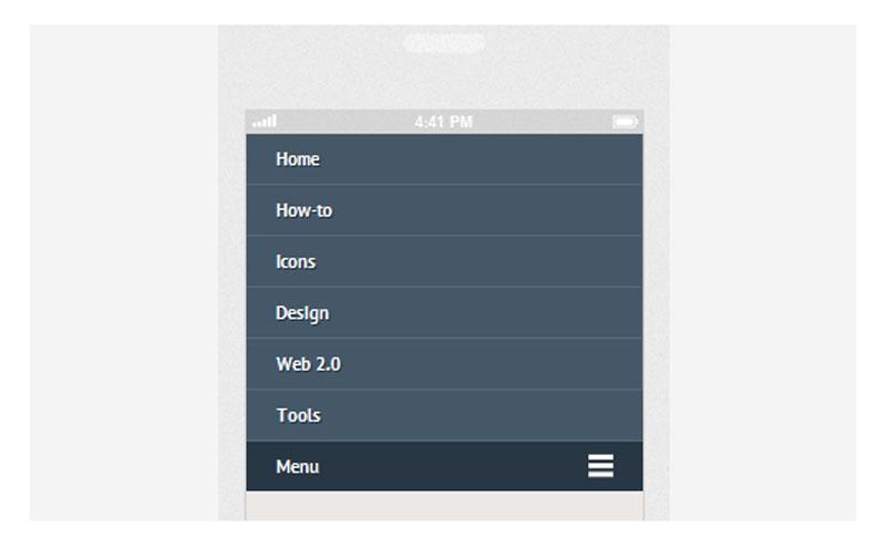
As navigation is one of the main aspects of any website, it’s worthwhile to take care of making it responsive. To figure out how to do it via jQuery and CSS3 media queries, don’t hesitate to read this detailed tutorial by Sarah Sparkle, a web and graphic designer.
Creating a CSS3 Responsive Menu
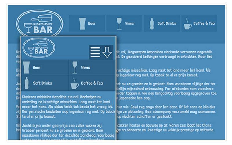
Following instructions of this tutorial by Shingo Tamura, an experienced web developer, you’ll have an opportunity to design a responsive menu adaptable to any screen size. Thus, it’ll be easy for visitors of your website to browse through it using their high-tech gadgets.
Responsive Thumbnail Gallery
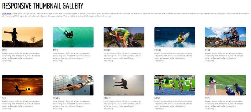
Nothing can attract as much attention as imagery, that’s why you shouldn’t ignore the necessity to create a responsive thumbnail gallery. Make use of the tutorial presented by Joshua Johnson, a designer and photographer at designshack.net, to succeed in this issue.
This set of responsive web design tutorials will turn out to be helpful for everyone who is eager to reach a wider audience. If you have any questions, feel free to ask them in the comments below. Thanks for reading us, and have a great day.


