
Grid – A Simple Guide to Responsive Design
Posted · Category: Framework, MIT License
As of 2013, there are thousands of different devices and screen sizes that browse the internet, so it’s impossible to design layouts to target them all. Instead, we must take a more fluid approach to design.
Grid is a simple guide to responsive design. By following those simple steps, you are on the path to responsive web design mastery. Keep practicing and help make the web a better, more useable place.
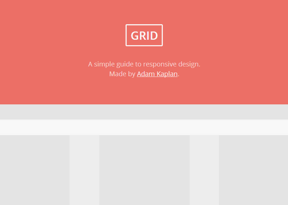
Source: http://www.adamkaplan.me/grid/
2 Comments


