
Modernize HTML5 Game with Hardware Scaling & CSS3
Modern browsers like Internet Explorer 10 are implementing stable versions of some interesting HTML5 features, including the offline, drag and drop and file APIs. These features are bringing us a new era of Web applications and fresh, quickly emerging gaming scenarios. In this two-part article, I’ll show how I used these new features to modernize my last HTML5 game, HTML5 Platformer. In this article, I’ll cover hardware scaling and CSS. In Part 2, I’ll cover the offline, file and drag-and-drop APIs. I hope you’ll get some great new ideas for your own games!
Note The URL demo is at the end of this article. Feel free to play using your favorite browser, and check out the Internet Explorer 10 gameplay video. The source code will be available for download in Part 2.
Scaling Across Devices
If you’re building an HTML5 game, you’re probably interested in the cross-platform nature of this standard programming language. But compatibility with a broad variety of devices means you have to take into account a huge number of resolutions. Compared to SVG, Canvas—at first—seems ill-prepared to handle this.
However, with a casual game based on sprites, there is a simple solution to implement. David Catuhe has done a great job of describing this on his blog, Unleash the power of HTML 5 Canvas for gaming – Part 1 (see the section called “Using the Hardware Scaling Feature†for specifics).
The idea is as simple as it is smart. You’re working inside a canvas at a fixed, predictable resolution, and you’re stretching it to the current displayed resolution using the canvas.style properties.
Step 1: Stretch
In the case of my little HTML5 Platformer game, the assets and level logic have been set to 800×480. So, if I want to fill a 1080p screen or a 1366×768 tablet, I need to build higher resolution assets to match those specs.
Before building all those assets, I can try a scaling operation—along with proper anti-aliasing—to increase image quality. Let’s give it a try.
The scaling operation simply requires this code:
window.addEventListener("resize", OnResizeCalled, false);

function OnResizeCalled() {

canvas.style.width = window.innerWidth + 'px';

canvas.style.height = window.innerHeight + 'px';

}
That’s it!
With hardware-accelerated browsers, your GPU will perform this operation at no cost. Anti-aliasing can even be enabled. That’s why David Catuhe thought it was worth mentioning in his Canvas performance article.
This trick is not specific to HTML5, by the way. Most modern console games are not internally computed in 720p or 1080p. Almost all of them render in lower resolutions (like 1024×600) and let the GPU handle the scaling/anti-aliasing process. In most cases, the method described here can help you boost the number of frames per second (FPS).
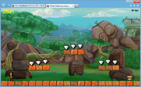
But by itself, this action raises a ratio problem. Indeed, when the canvas had a fixed size of 800×480, the ratio was controlled. Now I get the strange result shown in Figure 1 when resizing the browser window. The game is still playable, but it’s also clearly far from optimal.
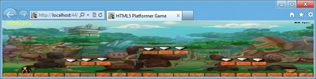
Figure 1 Applying Scaling on Its Own Can Produce Some Strange Results
Step 2: Control Your Ratio
The idea here is to control how the screen is filled when the browser window is resized. Instead of stretching anything further, I’m going to add some empty space on the right if the window is too large, or at the bottom if the window is too high. Figure 2 shows the code I used.
var gameWidth = window.innerWidth;

var gameHeight = window.innerHeight;

var scaleToFitX = gameWidth / 800;

var scaleToFitY = gameHeight / 480;

var currentScreenRatio = gameWidth / gameHeight;

var optimalRatio = Math.min(scaleToFitX, scaleToFitY);

if (currentScreenRatio >= 1.77 && currentScreenRatio <= 1.79) {

canvas.style.width = gameWidth + "px";

canvas.style.height = gameHeight + "px";

}

else {

canvas.style.width = 800 * optimalRatio + "px";

canvas.style.height = 480 * optimalRatio + "px";

}
Figure 2 This Code Adds Empty Space to Help Control Ratios When a Window Is Resized
The if statement creates an exception. If you hit F11 in your browser to switch to full-screen viewing, and you’ve got a 16:9 screen (like my 1920×1080 Sony VAIO Z screen or the 1366×768 Samsung BUILD tablet), the game will be completely stretched. This experience was quite awesome. Without this exception, the type of output you’ll see is shown in Figure 3. Notice the black areas below and to the right of the game, controlling the ratio.
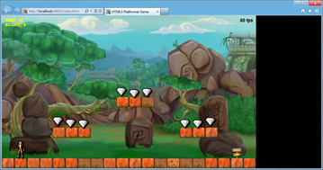
Figure 3 Empty Spaces Improve the Experience
Step 3: Center the Game with CSS3 Grid Layout
It would be even better if the game was centered, giving it a widescreen movie effect, right? Let’s do it.
Centering an HTML element can sometimes be painful. There are several ways to do it—and there are plenty of resources on the Web to help. I like to use a new specification named CSS Grid Layout (currently only supported by Internet Explorer 10), which is the base of our Metro-style layout in Windows 8.
Centering an element with CSS Grid Layout is straightforward:
- Switch the display of the container to display:grid.
- Define 1 column and 1 row.
- Center the inner element with the column-align and row-align properties.
Figure 4 shows the CSS I used in my case.
.canvasHolder {

width: 100%;

height: 100%;

display: -ms-grid;

-ms-grid-columns: 1fr;

-ms-grid-rows: 1fr;

}

#platformerCanvas {

-ms-grid-column: 1;

-ms-grid-row: 1;

-ms-grid-column-align: center;

-ms-grid-row-align: center;

}
Figure 4 CSS Used to Work with the CSS Grid Layout
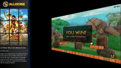
You’ll notice the prefix is “-ms†for Internet Explorer 10. Mozilla recently announced that it will also support the CSS Grid Layout specification for Firefox in 2012, which is excellent news. In the meantime, this centering trick works only with Internet Explorer 10. Figure 5 shows what it looks like.
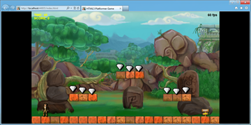
Figure 5 Centering with the CSS Grid Layout
Internet Explorer 10 windows will display vertical or horizontal black bars, similar to what you might see on a television screen. In other browsers, the results will match those of step 2 because the CSS3 Grid Layout specification will be ignored.
Using Smooth Animations
Now that we’re handling multiple resolutions with an easy scaling operation, it would be nice to play a smooth transition when the user resizes the window. It would also be great to play a cool animation when each level loads. For that, we’re going to use the CSS3 Transitions and CSS3 3D Transforms tools. On most platforms, hardware acceleration is provided by the GPU.
Animating Every Change Made to Canvas Style Properties
CSS3 Transitions is easy to use and produces smooth, efficient animations. To discover how to use them, you can read my colleague’s excellent article, Introduction to CSS3 Transitions, or play around on our Internet Explorer test-drive site, Hands On: Transitions.
I’ve set up a global transition for all my canvas properties, thanks to these rules:
#platformerCanvas {

-ms-grid-column: 1;

-ms-grid-row: 1;

-ms-grid-column-align: center;

-ms-grid-row-align: center;

-ms-transition-property: all;

-ms-transition-duration: 1s;

-ms-transition-timing-function: ease;

}
The canvas with the platformerCanvas ID will now automatically reflect any change made to its style properties in a one-second animation generated by an easing function.
Thanks to this new rule, resizing the browser window reduces or increases the size of the canvas with a smooth animation. I love the effect it produces—all with only three lines of CSS.
Note I also added the different prefixes (-moz, -webkit, and -o for Mozilla, WebKit, and Opera, respectively) for compatibility. You’ll want to remember to do the same.
Building a Cool Animation Between Each Level
Now I’d like to use CSS3 3D Transforms to temporarily make the canvas disappear. I’ll do this with an animated 90-degree rotation on the Y axis. I’ll load the next level after the animation rotates 90 degrees and comes back to its initial position (rotated zero degrees). To better understand the effect, you can play with our Hands On: 3D Transforms on the Internet Explorer test-drive site. Figure 6 shows an example.
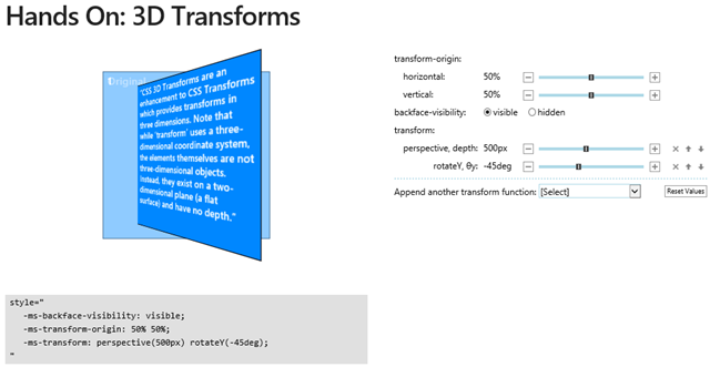
Figure 6 Testing Rotation Effects
We’re also going to play with the scale and rotateY properties to build a fun animation. For that, I’m adding two CSS rules and targeting two classes, shown in Figure 7.
.moveRotation

{

-ms-transform: perspective(500px) rotateY(-90deg) scale(0.1);

-webkit-transform: perspective(500px) scale(0);

-moz-transform: perspective(500px) rotateY(-90deg) scale(0.1);

}

.initialRotation

{

-ms-transform: perspective(500px) rotateY(0deg) scale(1);

-webkit-transform: perspective(500px) scale(1);

-moz-transform: perspective(500px) rotateY(0deg) scale(1);

}
Figure 7 Rules and Targeted Classes Related to Animation
First, my canvas has the initialRotation class set:
<canvas id="platformerCanvas" width="800" height="480" class="initialRotation"></canvas>
Now the idea is to wait until the player beats the current level. Once that’s done, we change the class of the canvas from initialRotation to moveRotation. This automatically triggers the CSS3 Transitions we set before to generate the animation.
To know when the animation is finished, an event is raised. It’s named differently in each browser. Here is the code I use for registering the event and targeting Internet Explorer 10, Firefox, WebKit and Opera:
// Registering to the various browsers vendors transition end event

PlatformerGame.prototype.registerTransitionEndEvents = function () {

// IE10, Firefox, Chrome & Safari, Opera

this.platformerGameStage.canvas.addEventListener("MSTransitionEnd", onTransitionEnd(this));

this.platformerGameStage.canvas.addEventListener("transitionend", onTransitionEnd(this));

this.platformerGameStage.canvas.addEventListener("webkitTransitionEnd", onTransitionEnd(this));

this.platformerGameStage.canvas.addEventListener("OTransitionEnd", onTransitionEnd(this));

};
And here is the code that will be called back:
// Function called when the transition has ended

// We're then loading the next level

function onTransitionEnd(instance) {

return function () {

if (instance.loadNextLevel === true) {

instance.LoadNextLevel();

}

}

};
And last, Figure 8 shows the code for my game that sets the moveRotation class on the canvas.
// Perform the appropriate action to advance the game and

// to get the player back to playing.

PlatformerGame.prototype.HandleInput = function () {

if (!this.wasContinuePressed && this.continuePressed) {

if (!this.level.Hero.IsAlive) {

this.level.StartNewLife();

}

else if (this.level.TimeRemaining == 0) {

if (this.level.ReachedExit) {

// If CSS3 Transitions is supported

// We're using smooth & nice effects between each levels

if (Modernizr.csstransitions) {

this.loadNextLevel = true;

// Setting the moveRotation class will trigger the css // transition

this.platformerGameStage.canvas.className = "moveRotation";

}

// If CSS3 Transition is not supported, we're jumping // directly to the next level

else {

this.LoadNextLevel();

}

}

else

this.ReloadCurrentLevel();

}

this.platformerGameStage.removeChild(statusBitmap);

overlayDisplayed = false;

}

this.wasContinuePressed = this.continuePressed;

};
Figure 8 Setting the moveRotation Class Notice that I’m using Modernizr to do a feature detection of CSS Transitions. We finally set back the initialRotation class inside the LoadNextLevel function:
// Loading the next level

PlatformerGame.prototype.LoadNextLevel = function () {

this.loadNextLevel = false;

// Setting back the initialRotation class will trigger the transition

this.platformerGameStage.canvas.className = "initialRotation";

// ... loadNextLevel logic stuff...

};
Note You may have noticed that I’m not setting the same transformation (and animation) for WebKit as for Internet Explorer 10 and Firefox in my previous CSS block. I do this because in my case, Chrome won’t behave the same way as Internet Explorer 10 and Firefox 11. I’ve set up a simple reproduction case on jsFiddle here: http://jsfiddle.net/5H8wg/2/.
Demo Video and URL
You can also play with this demo in Internet Explorer 10 or your favorite browser at Modern HTML5 Platformer.
In the second part of this article, I’ll show how to implement the offline API to make my game work without network connections, and how the drag-and-drop API can create another cool feature.
About the Author
David Rousset is a developer evangelist at Microsoft, specializing in HTML5 and Web development. Read his blog on MSDN or follow him @davrous on Twitter.


