
Full-Page Animations with CSS Transforms & Animations
Modern browsers like Internet Explorer 10 support CSS 3D and 2D Transforms and CSS Animations. By tapping the power of your GPU and running asynchronously from regular JavaScript, these technologies provide a more performant and flexible alternative to traditional script-based animations for Web content. I’ve talked about how to build with CSS 3D Transforms as well as CSS Animations and Transitions in previous articles. In this article, I’d like to introduce a more “unconventional†use case for these technologies by describing the concept of “full-page animations†that can be used during the navigation process to add fluidity and continuity to browsing. Our target is to achieve a seamless browsing experience in which content smoothly appears into view when the user visits a page and transitions away when he clicks on a link or performs a relevant action.
These effects can be accomplished by transforming the HTML <body> element using CSS Animations. However, this use case presents some considerations that we felt were worthy of discussion, such as the effect of layout and sizing on transforming <body>, as well as how to appropriately time page navigations so that they mesh properly with our animations.
The code samples in this post use unprefixed CSS markup as supported by IE10 Release Preview; other browsers may require vendor prefixes for the CSS Animations and CSS Transforms properties used.
Transforming a Page’s Entire Content
CSS Transforms are defined on the stylistic properties of an HTML DOM Element. For example, the markup for rotating an element 45 degrees along its Z axis would look like this:
#element {

transform: rotateZ(45deg);

}
Attaching a transform to the <body> element of your HTML document works exactly the same way. So performing in order to declaratively add the same effect to your document’s <body> you could do something like this:
body {

transform: rotateZ(45deg);

}
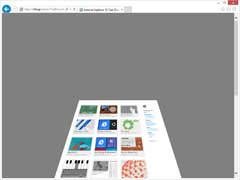
Let’s look at a before-and-after shot of a page when applying a transform to the body element:

For three dimensional transformations, the CSS Transforms specification defines the perspective property that can be specified on the parent of the element that we transforming. When transforming the <body> element of your content, it has to be applied to the <html> element that resides above it in the DOM hierarchy. Doing so is straightforward:
html {

perspective: 500px;

}
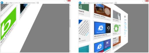
Combining this with a rotateY(45deg) transform on the <body> element yields the following result:

We can manipulate the transform-origin property on the body element for interesting results. Let’s look at a couple of examples:
body {

transform-origin: 50% 100%;

transform: rotateX(45deg);

}
The above markup sets a rotation along X for the body element while shifting the origin of rotations to the bottom of the element using transform-origin. Effectively this rotates the document’s contents “into†the screen like this:
We can also manipulate the perspective-origin property on the root element of our document to achieve an off-axis projection effect. Changing the style for <html> to:
html {

perspective: 500px;

perspective-origin: 90% 50%;

}
Our page now looks like this:

By using CSS Transforms, we can easily manipulate the visual appearance of the entirety of our page’s content. Since the usual layout and sizing rules still apply, some transforms on the body element (particularly ones that use percentage values or rely on the transform-origin property) can result in different visual effects depending on the content of our page. Recall our previous rotateX(45deg) example with transform-origin set to 50% 100%.
Below you can see the results before and after the transform is applied.
Notice how the content does not actually pivot on the bottom of the window but rather at some point outside of the viewport. This is expected behavior for CSS Transforms: the <body> is laid out normally, then it is rotated along its bottom edge that is somewhere off screen. You will also notice that the actual foot print of the content has expanded (take a look at the scroll bars in the “after†picture) in order to accommodate the transformed content (the fact that we are using perspective projection makes this effect even more pronounced).
So how do we deal with arbitrarily sized content when applying transforms to our body element? Custom tailoring all content in order to ensure that the size of the body does not expand more than a certain amount may be unrealistic. Instead, we can use a simple HTML/CSS pattern that allows us to fix the size of the body element to that of the browser window and append content inside a wrapper <div>. The following markup achieves just that:
html, body {

width: 100%;

height: 100%;

min-width: 100%;

max-width: 100%;

padding: 0;

margin: 0;

overflow: hidden;

}

#Wrapper {

position: absolute;

width: 100%;

height: 100%;

overflow: scroll;

}
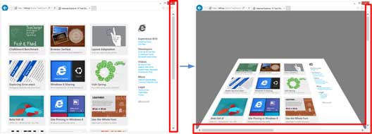
The illustration below shows what happens when a page is scrolled vertically and we apply a rotateY(45deg) transform to the <body> element of our document directly (left) and using the wrapper pattern (right):
The direct application of the transform results in a skewed visual result due to the off-axis projection (since we are no longer looking at the “center†of the body element). Using the wrapper pattern ensures that the <html> element’s perspective-origin property (50% 50% by default) will always be correctly centered with relation to the <body> element, giving us a pleasant visual effect.
By utilizing the above pattern and setting up CSS Transforms with percentage values whenever possible, we can affect our element in consistent ways, regardless of the size of its contents.
From Transforms to Animations
Having sorted out the intricacies of applying CSS Transforms to the <body> element, CSS Animations are the next step. By following the principles described above, we can create animations that bring our Web content into view (or remove it from view) in interesting ways.
Consider this basic @keyframes rule:
@keyframes rotateInLeft {

from {

transform-origin: 0% 0%;

transform: rotateY(180deg);

}

to {

transform-origin: 0% 0%;

transform: rotateY(0deg);

}

}
When applied to an element, this animation will cause it to rotate on its left side. When applied to a <body> element that uses our wrapper pattern the visual result is more interesting. The document will actually rotate from outside of the visible area of the browser window and into full view:

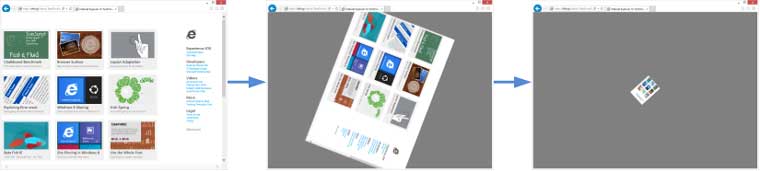
Similarly, we can compose animations that fluidly remove our Web content from view. For example, if we wanted our page to disappear into the distance while rotating, we could use something like this:
@keyframes whirlOut {

to {

transform: scale(0) rotateZ(1260deg);

}

}
With the visual result being:
Since we can use the full power of CSS Animations to affect the entirety of our Web content, we have a lot of flexibility in terms of generating these page effects (and we are certainly not limited to just using CSS Transforms). But once we have composed the effects that we want to apply to our content, how do we cause them to trigger during the page navigation process?
Attaching Animations to <body>
Our goal is to use trigger animations at strategic times during the browser experience in order to give the appearance of content transitioning into view when a page loads and out of view when the user clicks on a link.
The first intuitive place to add an animation to the body element would be the onload JavaScript event. As it turns out however, adding an animation when onload fires is actually too late. This event actually triggers when the entirety of the content in our page has finished loading (including any images or other bandwidth-intensive resources). Attaching an animation to onload on a bandwidth-intensive page would
result in our content displaying “normally,†followed by the animation triggering and re-bringing the content into view. Not exactly the effect that we were aiming for.
Alternatively, we could utilize the DOMContentLoaded event that triggers when the browser has finished parsing the DOM structure of our content (but potentially before resources have finished loading). The IE Test Drive DOMContentLoaded demo illustrates the difference between these two events. However, in cases of complex Web content, a modern browser may choose to perform “progressive†rendering, displaying the page before the entirety of the DOM tree has been loaded. In these situations, the visual result would be similar to the onload scenario.
The optimal place to set up an animation that transitions our page content in view is inline at the top of the element. This ensures that the animation will commence right as the content is being rendered (and that the starting position of the content will be that of the from keyframe of our selected animation). A pleasant side effect of this approach is that the animation may actually mask any progressive rendering, re-layout or resource loading that can occur with complex content.
Setting up the animations that transition our content out of view is also interesting. One could assume that we could attach an onclick handler to all elements of interest in our content (for instance all <a> tags) and just set the relevant animation properties (animation-name, animation-duration, etc.) in the callback function. However, if we do not actually delay the navigation from happening, we will not see our expected fluid transition. This is a good opportunity to utilize the animation events described in the CSS Animations specification. In particular, we can use the animationend event to detect when the animation has completed and then trigger a navigation (by setting window.location.href, for instance). Thus our onclick will trigger the “remove-from-view†animation and register a handler for animationend on that will ensure that the navigation event occurs.
Live Demo Available
We’ve created a demonstration and tutorial on bringing pages alive with CSS Transforms & Animations that provide depth and examples beyond what we’ve been able to show here. The tutorial itself utilizes full page animations during page navigation that work in Internet Explorer 10 on Windows 8 as well as recent versions of Chrome and Firefox.
To simply enjoy the page-to-page animations, step through the pages of the tutorial using the “Continue to …†links in the lower right corner of each page.
At the end of the tutorial we provide some additional guidance and sample code on how to incorporate these animations with your own Web content.
Wrapping it up
CSS Transforms and CSS Animations are two powerful feature-sets that enable richer and more immersive Web experiences. With a small amount of effort you can create Web pages (even static ones) that provide a fluid and almost app-like navigation experience.
About the Author
Charilaos “Harris†Papadopoulos is a Program Manager Intern on the Internet Explorer team. He focuses on graphics performance.


