WebAppers Complete Site Redesign Released
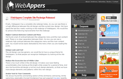
Finally, Webappers has a complete site redesign today. As you can see there is a hugh difference between the old design and the current new design. We have spent the last few weeks working on the redesign of WebAppers. We would like to achieve the following improvements from the redesign.
Higher Contrast Between Content and Menu
We found a lack of contrast between the categories menu and the main content part. There is no clear separation between them. So now you can see a relatively high contrast between the categories menu and the main content part. You would not be easily distracted by the menu when you are reading the posts.
Unique Look and Feel
The old design was too generic, we would like to have a unique theme for WebAppers. So that people can recognize WebAppers by looking at the site design.
Reduce the Excessive Use of White Color
There is too much white in the old design. It makes your eyes feeling uncomfortable when looking at the bright white screen for a period of time. And also We found the old design a not too much design elements, so that we have more design elements and patterns within this new design.
Avatar Next to Your Comments
We always found the commenting section of the old theme a bit boring. At the same time, Automattic (Owned WordPress) has just acquired Gravatar recently, it is now more than 3 times as fast. So that, we have implemented the Gravatar system on the commenting section of WebAppers, you can see your avatar next to your comments. We do not need to remeber your name, we can just recognize you by looking at your picture. I hope this can make the commenting section a little bit more interesting and encourage more people to discuss and comment on the posts. ( Go and get your Avatar now )
No Clustered Footer
Compared to the old clustered footer, the new footer is much simpler and useful.
Clear Seperartion Between Components and Design Related Resources
We are trying to separate Components Resources and Design Related Resources on the Right Hand Side Categories Menu. Currently, the categories menu is a bit messy.
I hope the new theme can improve the usability of WebAppers. We are still doing some little modification to the new theme. If you have any opinions, please feel free to leave a comment. Thank you very much for all of your support.