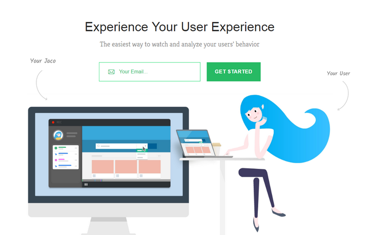
Jaco records and plays exactly what your users are seeing. No matter how complex your application is. Their unique recorder technology captures every user interaction as it happens in your application, including css animations and dynamic content. You’ll be able to get a look at your real users` experience.
They collect every user interaction and event by default, allowing you to get the information you need, when you need it. Advanced Filters, Easily filter your recordings by user actions, user details, or session info. Automatic Session Scoring, We automatically rate your sessions and highlight the most interesting and relevant ones.
Requirements: –
Demo: https://www.getjaco.com/
License: License Free
Cropper is a simple jQuery image cropping plugin. It supports options, methods, events, touch (mobile), zoom, rotation, scale (flip), canvas, multiple croppers and Cross-browsers. The outputted cropped data bases on the original image size, so you can use them to crop the image directly. If you try to start cropper on a cross-origin image, please make sure that your browser supports HTML5 CORS settings attributes, and your image server supports the Access-Control-Allow-Origin option. It has been tested on Chrome, Firefox, Internet Explorer 8+,Opera, Safari.

Requirements: jQuery Framework
Demo: http://fengyuanchen.github.io/cropper/
License: MIT License
App Store Screenshot Builder helps you create gorgeous images for your App Store page in minutes. LaunchKit’s Screenshot Builder will quickly export your screenshots in every resolution Apple requires (5.5″, 4.7″, 4.0″, 3.5″). You can easily change the font, text color, background color, or background image. Screenshots are saved with logical naming conventions making uploading to the App Store easy.

Requirements: –
Demo: https://launchkit.io/screenshots
License: License Free
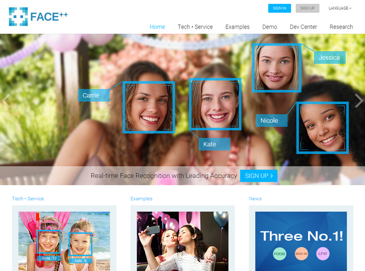
Face++ is a new vision platform built by Megvii Inc. aiming at providing compact, powerful, and cross-platform vision service. Face++ uses the cutting-edge technology of computer vision and data mining to provide 3 core vision services (Detection, Recognition, and Analysis).
With the service and huge database of celebrity from Face++, the developers can apply the face technology into their own websites, mobile Apps, and smart TVs, increasing incredible user experience. There is no limit on the times of API requests. However, there is a limit on the number of concurrent API requests.
Requirements: –
Demo: http://www.faceplusplus.com/
License: License Free
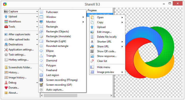
ShareX is an open source program that lets you take screenshots or screencasts of any selected area with a single key, save them in your clipboard, hard disk or instantly upload them to over 30 different file hosting services. In addition to taking screenshots, it can upload images, text files and all other different file types.
Upload files via Windows Explorer context menu or drag & drop. Upload clipboard content. You can also customizable after-capture-tasks such as annotating, adding effects, watermarking, uploading and other actions.
Requirements: –
Demo: http://getsharex.com/
License: GPL 3.0 License
JSCapture is screen capturing library implemented with pure JavaScript and HTML5. It allows you to make screenshots and record a video of your desktop from your browser. JSCapture uses getUserMedia for screen capturing. Currently the API for screen capturing is supported only by Google Chrome, Canary and Chromium by enabling an experimental flag.
In order to enable the flag:
1. Go to chrome://flags/#enable-usermedia-screen-capture.
2. Enable – “Enable screen capture support in getUserMedia()”.
3. Restart your browser.

Requirements: JavaScript Framework
Demo: https://mgechev.github.io/jscapture/
License: MIT License
Croppic is an image cropping jquery plugin that will satisfy your needs and much more. Simply upload an image, and then you are able to crop the image as you like with the zooming in and out functionality. It works in IE 10+, chrome, and firefox. It uses FormData so there is no IE9 and prev versions support at the moment.

Requirements: jQuery Framework
Demo: http://www.croppic.net/
License: License Free
Pageres is a command-line tool for generating screenshots in different resolutions for websites. Pageres is focus on sizes: you could script it to generate screenshots of responsive websites. The command-line options allow you to specify many dimensions at once, so it’s easy to generate results for a responsive site.

Requirements: PhantomJS
Demo: https://github.com/sindresorhus/pageres
License: MIT License
Clmtrackr is a javascript library for fitting facial models to faces in videos or images. It currently is an implementation of constrained local models fitted by regularized landmark mean-shift, as described in Jason M. Saragih’s paper. Clmtrackr tracks a face and outputs the coordinate positions of the face model as an array.
The library provides some generic face models that were trained on the MUCT database and some additional self-annotated images. The aim is to also provide a model builder for building your own facial models. The library requires ccv.js (for initial face detection) and numeric.js (for matrix math).

Requirements: JavaScript Framework
Demo: https://github.com/auduno/clmtrackr
License: MIT License
Design Shack has written a nice tutorial on Focal Point: Intelligent Cropping of Responsive Images, which is going to look at a fascinating little framework that allows you to not only automatically resize your images when the viewport changes, but also crop the images with a specific important focal point in mind. Amazingly enough, it does all this with pure CSS.
Focal Point is a GitHub project and CSS framework created by Adam Bradley. The concept of responsive images requires that any images on your page resize and reflow to achieve optimal layout for the current viewport size. Focal Point takes this idea a step further though and not only resizes your images, but crops them as well.

Requirements: CSS
Demo: http://designshack.net/articles/css/focal-point…
License: MIT, GPL v2 License


