
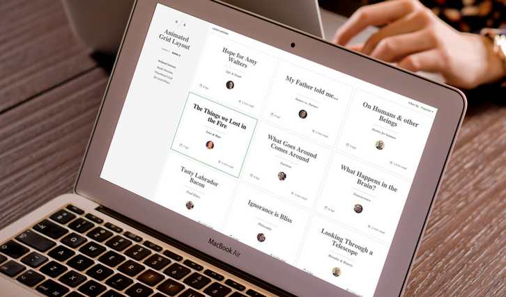
A Responsive, Magazine-like Layout with Animated Grid
Today Codrops has shared a Grid Item Animation Layout with us. The responsive layout has a sidebar and grid items that animate to a larger content area when clicked. In the first demo the content area fills the grid and in the second demo, the whole layout moves to the left while the grid item is expanding. The expanding element is not animating in width and height but instead its original dimensions are already of the expanded size and we simply scale it down initially. By setting classes, we control the transitions of all the elements: the grid item elements’ disappearance and the content elements’ appearance.
The layout is responsive down to mobile using a media query technique that involves setting the breakpoints based on the grid item size and the sidebar. For this we use Sass, which allows us to set these kind of variables easily. The approach we are using here is mainly mobile-first, but we also do some specific restructuring for small screens.
Requirements: –
Demo: http://tympanus.net/Development/AnimatedGridLayout/
License: License Free

