
Design a Transparent Website Layout in Photoshop
Would you like a Transparent Website Layout? It can be very useful if you would like to have a different theme for your website, but do not want to change too much of the design. Simply changing the background image can also give you a whole different feeling sometimes. We are going to teach you how to design a transparent website layout in Photoshop. Hope you would find it useful.
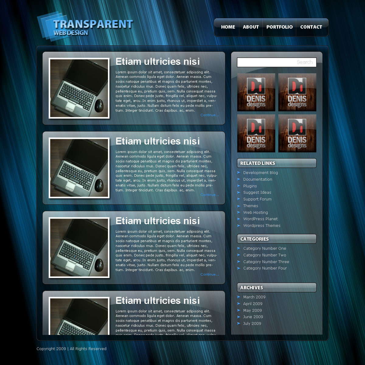
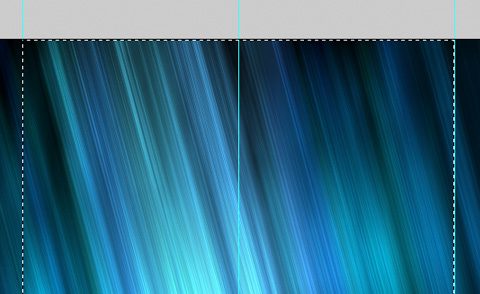
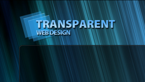
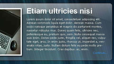
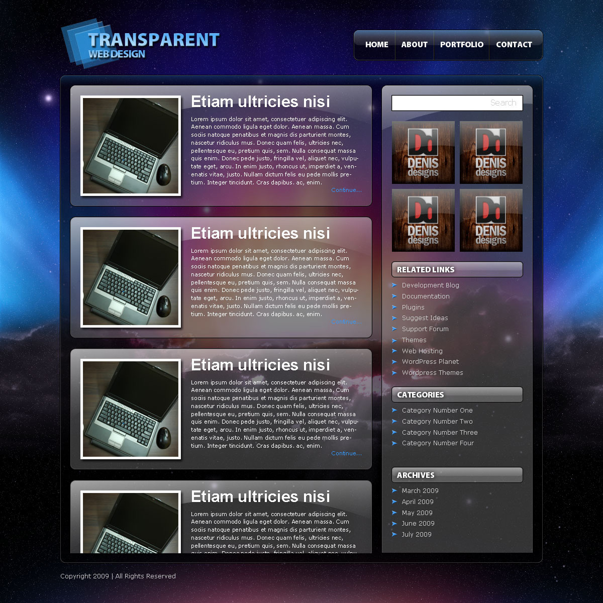
Final Result
A Transparent Website Layout is what we are about to make. You can click on the image to see a full-scale version.
Background
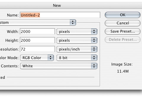
Step 1
Lets start off by creating a new document 2000x2000px.
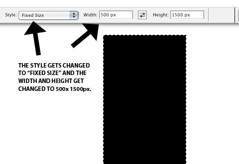
Step 2
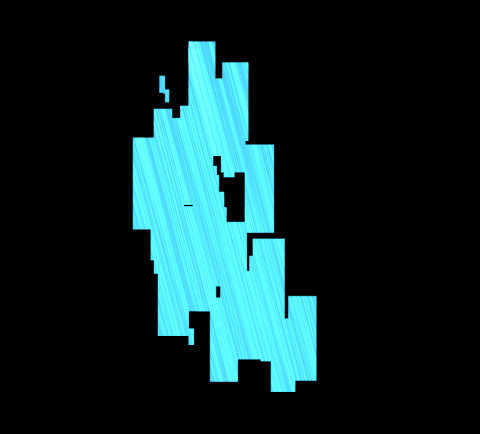
Using the marquee tool, create a box 500px wide by 1500px tall. Fill with black
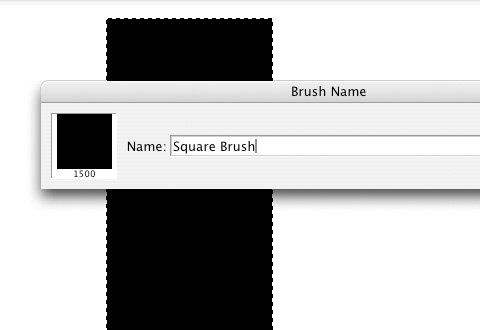
Step 3
Go to Edit>Define Brush Preset. Change the name to “Square Brush†and press ok. Now we should have our brush in with the rest of the brushes.
Step 4
Close out of the 2000x2000px document, because we are done with that one. Now open a new document 1200x1200px and fill with black.

Step 5
Create a new layer (Control + Shift + N) and fill it with black also.
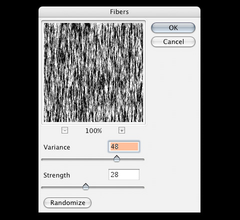
Go into Filter>Render>Fibers. Adjust the settings like I have to get a real good contrast.
Step 6
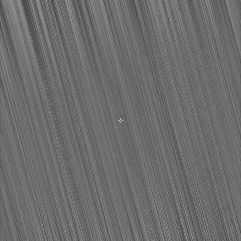
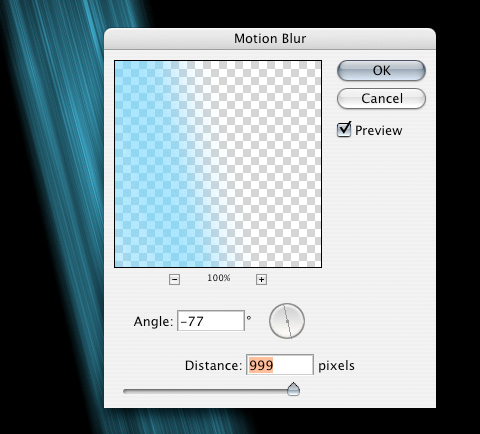
Now Go into Filter>Blur>Motion Blur and adjust the settings to 999px.
Using the transform tool (Control + T), hold down shift and rotate to the left one spot. Stretch out the fibers so that it covers the entire area.
Step 7
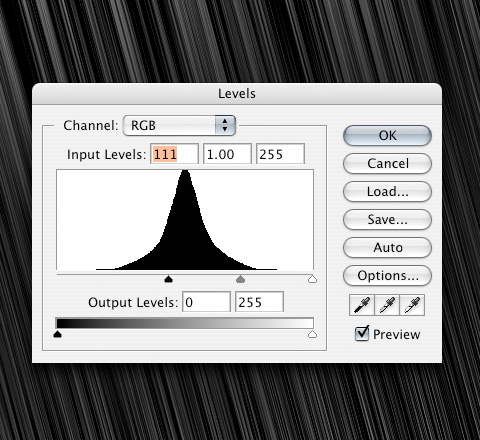
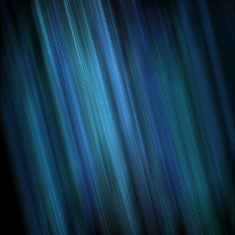
Open up the Levels (Control + L) and adjust them as I have. This is going to darken our fibers.
Step 8
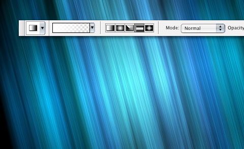
Change the blend mode of the fibers layer to Color Dodge.
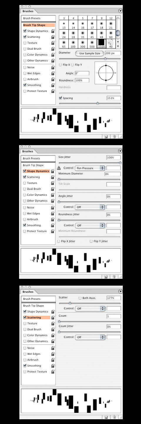
Now select the brush we made, then push F5 to open up our brush settings.
Change the settings as I have them.
Step 9
Create a new layer (Control + Shift + N), and move it under the fibers layer.
Pick a blue color and paint a little area with our brush. Since we changed our brush settings, the brush we made should be scattered something like what I have.
Step 10
Go to Filter>Blur>Motion Blur with the distance at 999 px.
Step 11
Repeat steps 9 and 10 with different variations of blue, creating a new layer for each color, until you get something you like.
Step 12
Create a new layer just under the fiber layer. Click on the gradient and choose the Reflected Gradient tool. Make sure the color is white to nothing.
Click and drag a gradient in the middle of the document, following the line of the fibers.
Change the Blend Mode to Overlay, and drop the opacity down to 60%. This will give us a light source in the middle of the document.
This is the finished product of our background. Now we are going to get started on putting together the actual website.
Website
Step 13
Before we get any further I am going to take all of the layers from my background and put them into a folder to keep it organized.
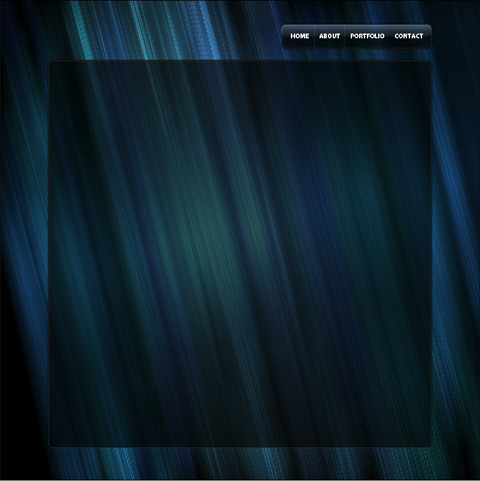
Click on the background layer, then click and drag a guide out to the middle of the document. The guide should snap into place at the middle. If it doesn’t go to View and make sure Snap is checked.
Using the Marquee Tool create a box 960x1200px. We are going to move it over using the transform tool (Control + T) to get the anchor points on the corners and the middle of the box. Line up the middle anchor points with the middle guide. Put a guide on each side of the box.
Step 14
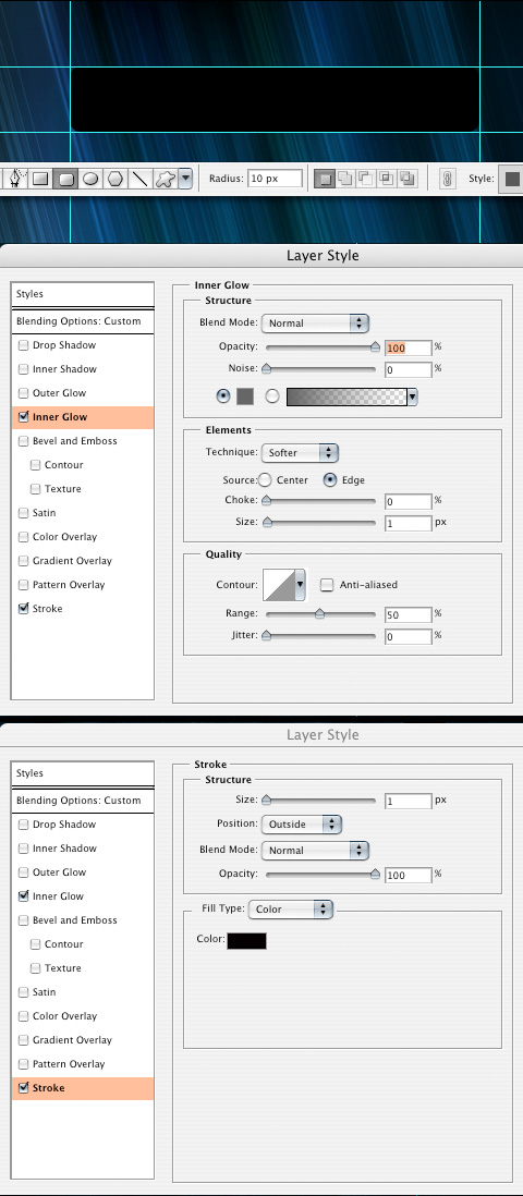
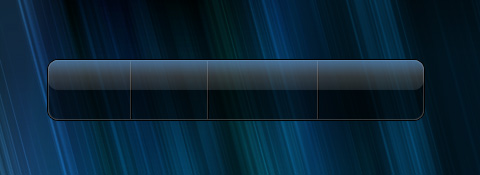
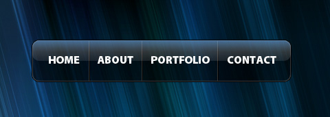
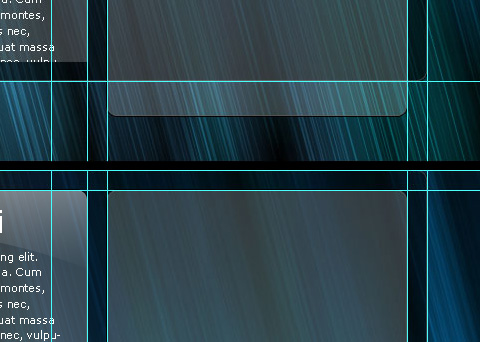
Using the marquee tool create a box 375x60px and rest the right side of it on the right guide and the top on the top of the document. Hold down shift and move it down six times. Put guides on the top, bottom and left sides.
Using the Rounded Rectangle Tool, create a box inside the guides, with a radius of 10px.
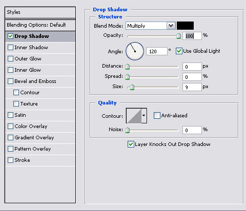
We are going to add some layer styles to the box, so go into the first icon at the bottom of the layers palette, and click on Inner Glow. Change the settings as I have them with a color of #666666, then click on Stroke with a color of #000000.
Step 15
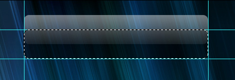
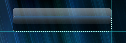
Click on the marquee tool. Now Control and click on the shape we just made. Hold down shift and move the shape up three spaces. Using a linear gradient fill the area with white. Drop the opacity down to 60%.
Step 16
Create a new layer and change the foreground color to #3399FF. Control + click on the box. Now, using the linear gradient again, create a blue gradient at the top of the box.
Step 17
Do Control + Shift + I to get the inverse selection, then select the white gradient layer and delete. This will get rid of the extra part that we don’t need.
Step 18
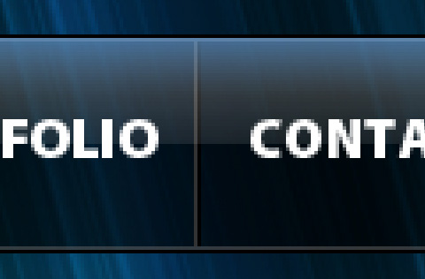
Using Myriad Pro Black at 16 pt type out your navigation in white.
Using the square marquee tool click and drag a box 1px wide and the height of the box. Fill it with #333333. Move the marquee over one spot and fill it with #000000.
Step 19
Repeat step 18 so there is a break in between each button. Put all the navigation layers into a folder.
Step 20
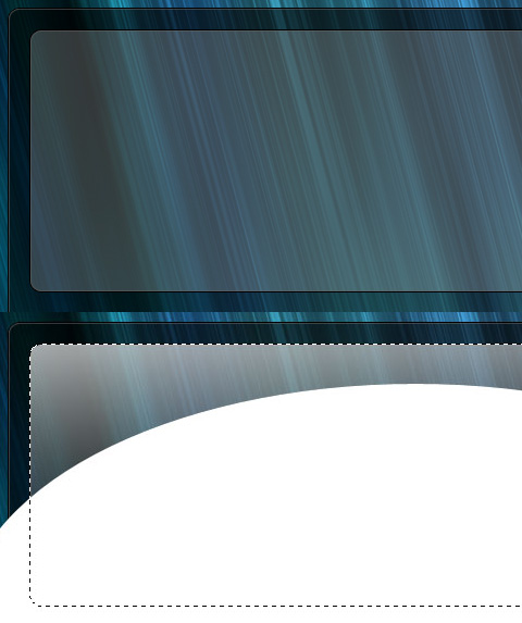
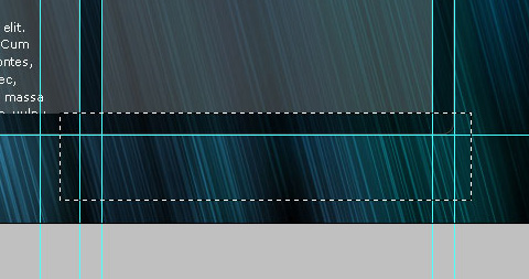
We are going to create the body of our website. Using the marquee tool create a box 960x970px and rest the top of the box on the bottom of our navigation bar. Hold down shift, and move it down three spaces. Put a guide on the top and bottom of the marquee.
Using the Rounded Rectangle tools, Create a box within those guides as well as the far left and right ones.
Click and drag the layer styles from the navigation box onto the website box.
Step 21
Grab a logo and bring it into your document. Line up the left side of the logo with the left guide.
Step 22
Using the marquee tool create a box 600x240px and put guides around it like we did with the navigation and the website box. Using the rectangle tool make a box on the guides we just created. Give it the same layer styles as the navigation, fill it with white and change the opacity to 20%.
Put the white box into a new folder called “Post 1â€.
To add the reflection, use the Ellipse tool to create an oval on the bottom half of the box. Control and click on the circle and then do Control + Shift + I to get the inverse selection. Select the linear gradient with white to nothing selected for the color. Click and drag a gradient.
Once you get a gradient you like do Control + Shift + I and delete the extra area.
Step 23
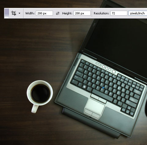
We are going to go and grab this laptop image (http://www.sxc.hu/photo/1185958)from stock.xchng.
Open it up in Photoshop and click on your Crop Tool. Adjust the settings so it is 200x200px at 72 pixels/inch.
Bring it into our document.
Step 24
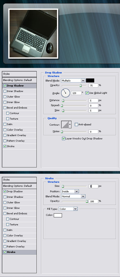
Put the photo at the top left of the post box, then holding down Shift, move the photo down twice and to the right twice.
We are also going to add some layer styles. So click on the layer styles icon and click on stroke. Change the settings like what I have, with a color of white. Now add a drop shadow.
Step 25
Now lets put in some dummy copy:
Etiam ultricies nisi Lorem ipsum dolor sit amet, consectetuer adipiscing elit. Aenean commodo ligula eget dolor. Aenean massa. Cum sociis natoque penatibus et magnis dis parturient montes, nascetur ridiculus mus. Donec quam felis, ultricies nec, pellentesque eu, pretium quis, sem. Nulla consequat massa quis enim. Donec pede justo, fringilla vel, aliquet nec, vulputate eget, arcu. In enim justo, rhoncus ut, imperdiet a, venenatis vitae, justo. Nullam dictum felis eu pede mollis pretium. Integer tincidunt. Cras dapibus. ac, enim. Continue…
The “Etiam ultricies nisi†will be our title. Arial/Helvetica Bold at 32 pt. The rest of the copy will be Verdana at 11pt. The color of the “continue†will be #3399FF.
Step 26
Right-click on the “Post 1†folder, Duplicate Layer Set and call it “Post 2â€. Put the top of the second post on the bottom of the first post and then hold down shift and move “Post 2†down two spaces.
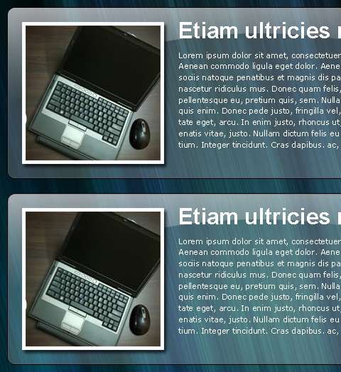
Step 27
Repeat step 26 for the third and fourth posts. For the fourth post click on the “Post 4†folder, then click on the layer mask (second icon from the left on the layers palette). Use the marquee tool to create a box around the area of the fourth post that is on the website box. Hold down shift and move the marquee box up two spaces. Then do Control + Shift + I to get the inverse selection and fill with black.
Step 28
Now let’s make the sidebar. Using the square marquee tool make a box 300px wide and put it on the far right guide. Hold down shift and move it in two spaces. Put a guide on the left and right sides of the square marquee.
Step 29
Using the rectangle tool make a box within the guides we just made. Make sure the box lines up with the first post box at the top and it goes below the bottom of the website box at the bottom.
The sidebar box is going to be white and have the same layer styles as the post boxes.
Step 30
Click on the mask icon on the layers palette. With the square marquee tool, create a box that covers the sidebar from the very bottom of the document to the bottom of the website box. Hold down Shift and move the square marquee up two spaces. Fill the area with black. This should get rid of that extra area.
Step 31
We want to add a reflection like we have on the posts. To do this we have to duplicate the layer with Control + J and move it over above the sidebar box. Control and click on the sidebar box, then Control + Shift + I to get the inverse, and delete the extra area.
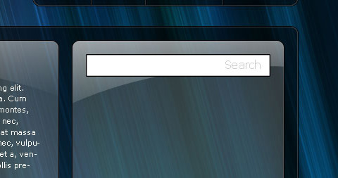
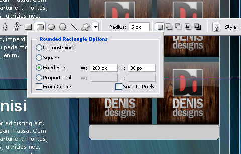
For the search bar make a white box with the square marquee tool. The size of the box is going to be 260x30px and it is going to be placed at the top left of the sidebar. Hold down shift and move it over two spaces to the left and two spaces down.
The search box is going to have the same layer styles as the sidebar box.
Using the text tool create some text that says “Search†with 16pt Verdana and a color of #CCCCCC.
Step 32
Now we are going to put in some ads. These ads are 125×125 and are going to go two spaces down, holding Shift and two spaces from the edges.
The bottom two are going to be Shift and down one space from the bottom of the top ads.
While you are at it put a guide on the left and right sides of the ads.
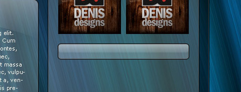
Step 33
Click on the Rectangle Tool and in the options, click on the down arrow to the right of all the different shapes. Click on fixed size, and change it to 260x30px. Put the rectangle so the top is touching the bottom of the ads, and holding down shift move down two spaces.
Change the color to white, at 20% opacity
Step 34
Now to get the reflection, Control and click on the rectangle we just made. Push Control + Shift + N to get a new layer. Now click on the square marquee tool and move our selected area up so the bottom is at the middle of the rectangle.
Fill with a white to nothing linear gradient.
Step 35
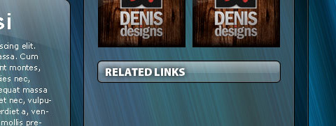
Type in “Related Links†with the font, Myriad Pro Black, and a size of 16 pt.
We are going to give it a slight background shadow to make it stand out a little better.
Step 36
For the links we are just going to use the generic WordPress links:
Development Blog Documentation Plugins Suggest Ideas Support Forum Themes Web Hosting WordPress Planet WordPress Themes
The text is going to be white 12pt Verdana. We are going to hold Shift and move it in two and down one from the “Related Links†head.
Step 37
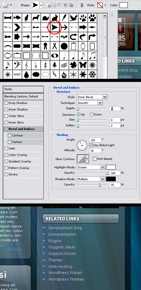
To get the arrow bullets, select the custom shape tool (same button in the toolbar as the rectangle tool) and choose the same arrow I did.
Change the color to #3399FF and add a Bevel and Emboss from the layer styles icon.
Step 38
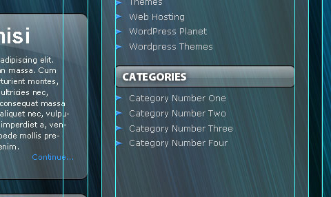
Repeat steps 37 and 38 except our header is going to be “Categories†and for our mock up we will just put:
Category Number One Category Number Two Category Number Three Category Number Four
Step 39
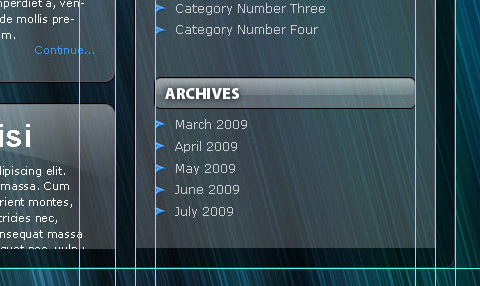
Repeat steps 37 and 38 except our header is going to be “Archives†and for our mock up we will just put:
March 2009 April 2009 May 2009 June 2009 July 2009
Step 40
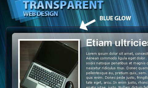
We want to add a blue glow on the website box like we have on the navigation bar. To do this Control and click on the website box and create a new layer with Control + Shift + N.
Using the linear gradient click and drag a #3399FF gradient from the top down.
Step 41
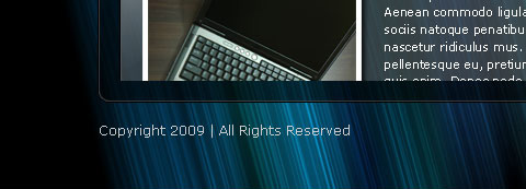
Finally we will put in our footer information. Hold down shift and move the footer text down two spaces.
Final
Here is the final version. The great part about working with a transparent website is that you can change the background image to completely change the look of your website.
About the Author
Tyler Denis is a part-time freelance designer from Ashland, New Hampshire. He is also the creator/writer of the design blog Denis Designs/blog, a website dedicated to bringing quality tutorials and inspiration. You can follow him on Twitter or at his personal site, Denis Designs.