If you want to know what you’re worth, Hired has the answer: with data from thousands of real interview requests and job offers, we’ve put together a salary calculator that can tell you what you could be making in your job based on the skills you have.
If you want to find out how much more you could actually earn, join Hired. Just set up your profile, and companies will give you job offers with salary and equity upfront before you interview. Get multiple job offers from top companies with just 1 application.

Try Hired today!
This content is sponsored via Syndicate Ads.
Most everyone working or training in the technology field understands that they will be changing jobs every three years— this is part of being involved in the fastest growing and most lucrative industry in the world.
Indeed, the top employment site in the world, has created a special site just for tech: Indeed Prime. Indeed Prime has been designed and developed to match the most in-demand technical job seekers with the best of tech employers.
The service is exclusive but it is still free to job seekers. Right now, Indeed Prime is available to candidates and companies based in Austin, Boston, San Francisco, Seattle, and New York City. Plans are to expand the priority tech job service to other cities in the United Sates in the future.

Benefits for the job seeker
Job seekers can use Indeed Prime for free.
You can realistically expect to get between three and five developer job offers in a week.
The best and newest tech companies compete for you. That means your salary, equity in your new employer, and the perks of your new position increase through competition.
The employers that compete for you have been vetted by Indeed Prime so you can be sure the money is there. You do not have to do the usual vetting of a potential employer because Indeed Prime has done it for you.
Your one time application allows you to be presented to multiple companies that need your skills now.
Indeed Prime lets you keep your job search secret by hiding your profile from your current employer.
Indeed Prime will give you a $5,000 bonus if you land a job through the service with a company that is involved with Indeed Prime.
There are rules
Indeed Prime is exclusive in the criteria for job seekers and companies. The benefit to both is a shorter time frame in filling a position with qualified people that are capable of hitting the ground running.
The job seeker must have a high level of verifiable skills in the specific area that a potential employer is looking for.
The company must have a strong tech presence and a proven track record in the tech industry.
The company must prove to Indeed Prime that it is financially solvent and has a bona fide position that is presently unfilled. This eliminates wasting time with those positions that are already filled internally but posted due to legal regulations.
You must be willing to move to the area where the job is if you do not currently live in that area.

**
All in all, this is a really great and refreshingly simple idea. Indeed Prime connects the most qualified tech job seekers with vetted companies that have a real need to fill verified positions right away. Since the site is catered to the tech industry, it cuts down on the time both parties need to spend on sorting through relevant jobs and applicants. Advance your career today and check out Indeed Prime.
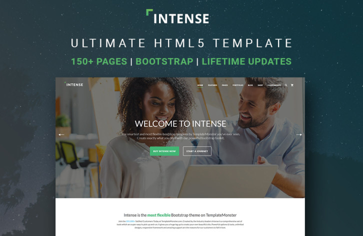
The fastest way to build a website is to use a readymade website template, plus do some customization (depending on your requirements). And when a few years ago that was the choice of small companies and bloggers, today even the largest corporations opt for these tactics. Indeed, why reinvent the wheel if you can use the achievements of hundreds of professionals for a nominal price?
Today we are pleased to introduce you to one of the most promising web-design products of 2016 – an ultimate HTML5 template dubbed Intense.
What is “Intense�
Demo | More Info
In general, Intense is a multipurpose HTML5 website template with hundreds of readymade pages, but it’s too versatile to be given a precise definition. It was conceived as a one-stop solution, and that’s why it is jam-packed with pages, design components and plugins. And since it’s a pure HTML template, and not a CMS theme, you can easily pick only the elements you need for your current project without digging into the code too deeply. That’s why Intense can grow exponentially, but remain convenient and easy-to-use at the same time. Read the rest of this entry »
Designers and developers are in demand, so shouldn’t companies apply to hire you instead of the other way around? That’s exactly how it works on Hired. Hired is a platform that gives you an easy to way to get jobs at top companies in SF, NYC, and 14 other tech hubs around the world.
How does it work? When you create your profile on Hired, companies like Uber, GitHub, & Stripe will be able to send you interview requests. Most candidates get 5+ requests throughout their first week, with salary and equity offered up front. When you get an opportunity you like, we’ll connect you directly with their team and Hired’s team of trained Talent Advocates can even help with interview prep and salary negotiation. It’s totally free, and Hired will block your employer and anyone else you want from ever seeing your profile. Even if you’re just curious to find out your market value, trying Hired is easy and there’s no commitment. Just use the link below to create an account, and instantly apply to 3,000+ companies within 10 minutes.

Try Hired today!
This content is sponsored via Syndicate Ads.
MaintainableCSS is an approach to architecting and writing CSS that helps you and your team write modular, scalable and maintainable code. In practical terms, this means that as a developer I want to create new features, or edit existing features without having to concern myself with overriding styles I don’t want applied, or worse that the code I write causes regression elsewhere.
MaintainableCSS is not something you can download. It’s a set of principles, guides and conventions that help you write CSS for large or small scale websites. Having maintainable code means that I can edit a module and it’s styles without worrying that I have negatively caused problems in other modules by accident. I want to be able to to write code that provides peace of mind knowing that my code is encapsulated. Write CSS without worrying that overzealous, pre-existing styles will cause problems. MaintainableCSS is an approach to writing modular, scalable and of course, maintainable CSS.

Requirements: –
Demo: http://maintainablecss.com/
License: MIT License
There are times, when you are suddenly faced with the necessity of working with a huge amount of data in WordPress. To make things even more difficult, your client is looking for a solution involving a MySQL table, and he would like to have the results fairly quickly.
Creating graphs or tables from large quantities of data is not one of your strong points. Even if a plugin type tool were available, there will still be a steep learning curve to contend with; or so you think.
Whenever you find yourself in such dire straits, you hope a superhero might suddenly appear to free you from your dilemma; a superhero that is faster than a speeding bullet, has x-ray vision, and can move and manipulate huge stacks of data, as if they were feather-light.
wpDataTables is such a superhero.
wpDataTables is a WordPress plugin that can solve virtually any graph- or table-building issue you are likely to encounter; and you can depend on it to arrive on the scene in your time of need.
wpDataTables’ Amazing Superpowers

In the past, you may have tried to become proficient at MySQL This would only make sense if you had a continual need for it. That would only justify the huge amount of time necessary to learn the ways MySQL works.
There is of course a better way, and one that doesn’t require you to take time away from your design activities. All you need to do is learn how to put this WordPress table and charts plugin to use. That will take you no time at all, and you can then bring your superhero’s superpowers to bear. Read the rest of this entry »
If you want to know what you’re worth, Hired has the answer: with data from thousands of real interview requests and job offers, we’ve put together a salary calculator that can tell you what you could be making in your job based on the skills you have.
If you want to find out how much more you could actually earn, join Hired. Just set up your profile, and companies will give you job offers with salary and equity upfront before you interview. Get multiple job offers from top companies with just 1 application.

Try Hired today!
This content is sponsored via Syndicate Ads.
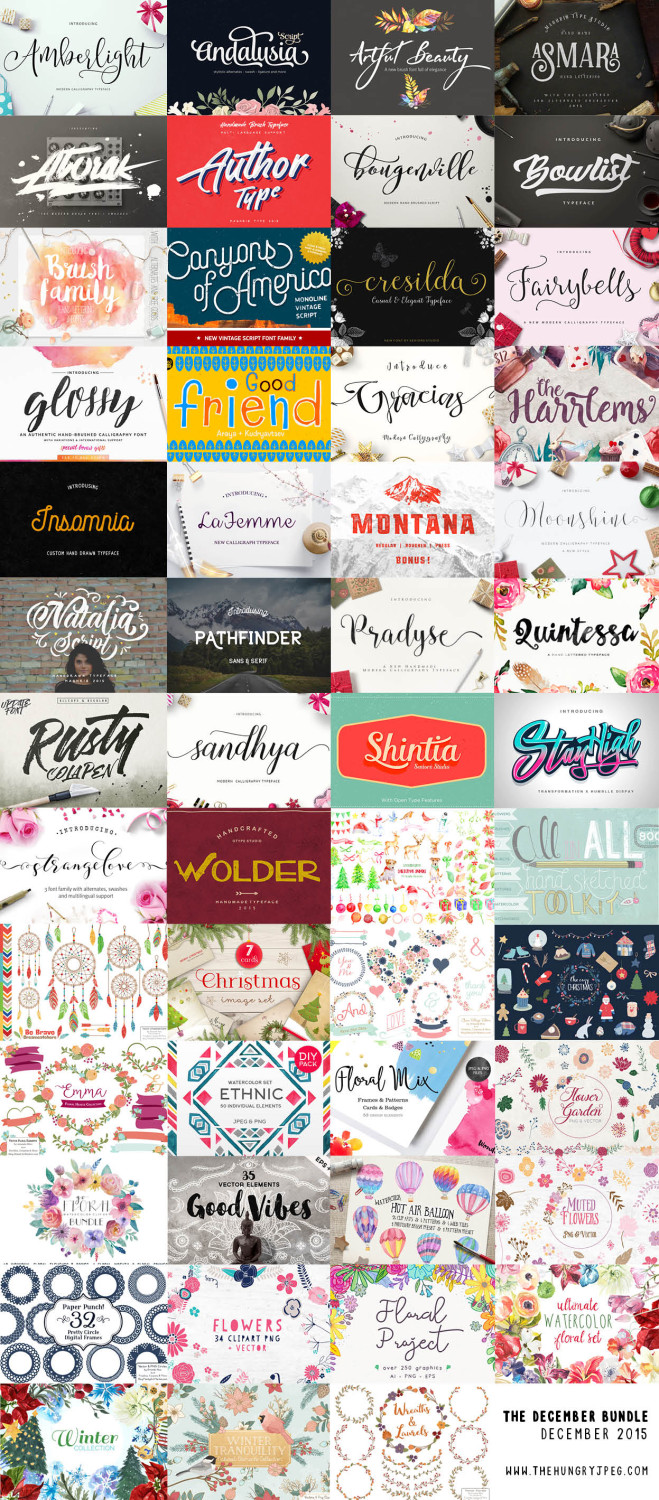
The December Bundle is the deal for the holidays and all year. You get 30 fonts and 1,500 graphics all for $29 and they even give you a 10 percent discount if you tweet them. You get the fonts, the graphics, a Windows and Mac friendly installation guide, a commercial use license, a lifetime download guarantee, and unlimited support for all the fonts in this December bundle. You even get some free extra fonts in over half of the fonts in the December bundle.
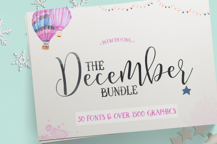
There is enough variety included in this December bundle to open your own print shop or go into the Christmas card business. The variety of graphics is absolutely perfect for making Christmas cards or any kind of card. This December bundle includes all the script fonts and block fonts you need to make any card of gift a very special personal item that will be treasured because you made it.
Downloading one font at a time is expensive – and you never want to spend more than absolutely necessary when you are involved in graphic design. Whether you are creating signage, flyers, book covers, or anything else, The Fontabulous Font Bundle is one of the best deals. There are more than 70 fonts in the bundle and it’s only $29.
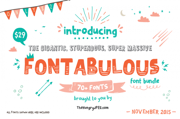
This is a special low price only for the month of November. That means that each font is only a little over 30 cents – and that’s an amazing deal you’re not going to find all the time. The best part is that each and every one of the fonts comes with free support and commercial licenses. Read the rest of this entry »
Hundreds of Photoshop creative tools.Including overlays, templates, gradients & more.
With even more Photoshop tools, what else will you be able to create? With this Photoshop Creative Tools Super Bundle of textures, brushes, special effects, overlays, actions, templates, gradients, and smart PSDs, you’ll have every tool you could ever need to expand Photoshop’s power.
Hundreds of tools are included. Ones that will work for both photography and design. You’ll get brushes and textures and effects that will re-imagine and enhance what you’ve shot. PSD templates and overlays that will radicalize and refresh how you present your designs.
But words can’t convey just how good these tools are. Seeing is believing, after all. Look below for all the effects you’ll get with super bundle. Just remember that this bundle is available for only a limited time. Right now, you’ll get them for $28. Normally, they’re $143!
Can you show me the effects ? What’s included in this?
You’re going to get a bundle of various Photoshop creative tools and effects. Every set is shown below. They work for Photoshop CS5+ higher versions
Autumn Effects Set

These effects come as PSD templates. They are customizable and adjustable to what you’re looking for.
Features:
- 3000×2000 px
- 300 dpi
- 24 overlay textures in jpg format (psd. file with all textures also included)
Read the rest of this entry »


