How to Build a Responsive and Mobile-Friendly Tooltip
Posted · Category: License Free, Tooltips
Tooltip is a splendid invention. Small detail in web design that plays a big role when it comes to user experience. Usually, tooltips are used to present a tiny amount of hidden content, that pops up when user moves a cursor over or clicks on a special target.
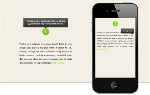
Osvaldas Valutis built a Responsive and Mobile-Friendly Tooltip using CSS and jQuery. It relies on a maximum width value when viewed on large screens, adopts to narrow environments and picks the best viewable position relatively to the target. It’s mobile-friendly. It pops up when a call-to-action button is tapped and disappears when tapped on the tooltip itself.
Requirements: jQuery Framework
Demo: http://osvaldas.info/blog/elegant-css-and-jquery-tooltip…
License: License Free
4 Comments


